By Alex Stevens and Kent Reese
This is the Paradise Island Duel-Play our goal was to make a Duel-Play that
- Resembles paradise on a tropical island
- Makes players feel relaxed as they have fun
- Uses ramps to connect both playboxes
- Implements use of thematic spinners and studs
- Incorporates fair scores for both players
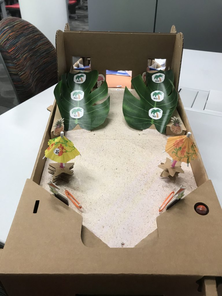
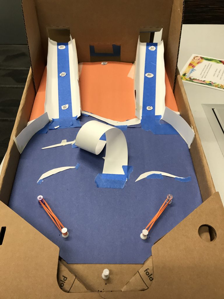
We feel, based on the feedback from the play session and the aesthetic of the board, that we accomplished our goals. Our board looks like a tropical paradise, and the play board isn’t too chaotic as to stress players out.
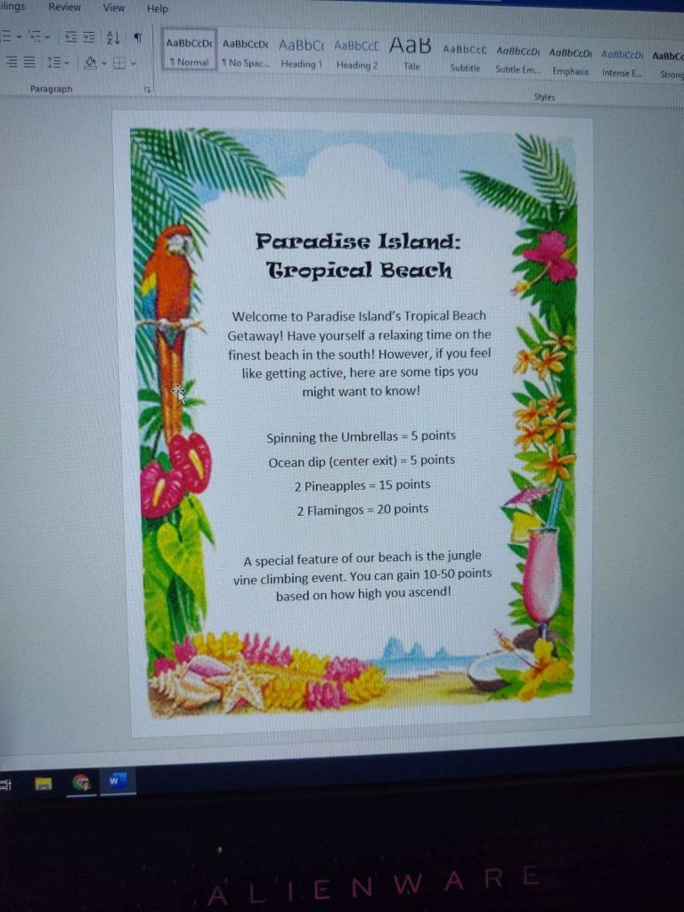
Alex also made a rulesheet for the game:
The biggest complaint we got was over these ramps, the loop on Kent’s side, and the walls adjacent to the ramps on Alex’s side:
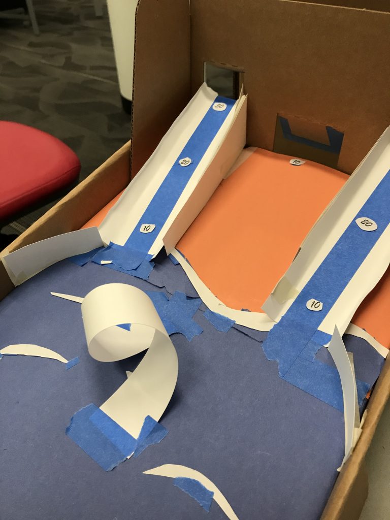
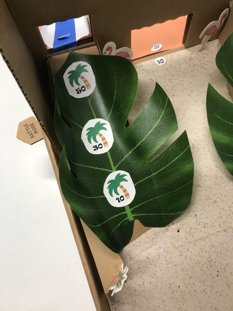
These ramps are really difficult to get the ball over on to the other side, making it difficult for either player to have a meaningful or consistent cross play between the two sides. If we were to remake the machine, the ramps would be shallower as to allow the ball to ascend easier.
The loop worked, players were able to successfully loop the ball several times, but it killed the momentum of the ball, making the middle gate nearly impossible to get the ball through, making for an inconsistent and frustrating experience.
The walls on Alex’s board are directly in line with both the plunger and the “bozo zone”, making shots bounce back very quickly and the ball being sent to the gutter pretty often if you weren’t tact with it. This was counter-intuitive to our design goal.

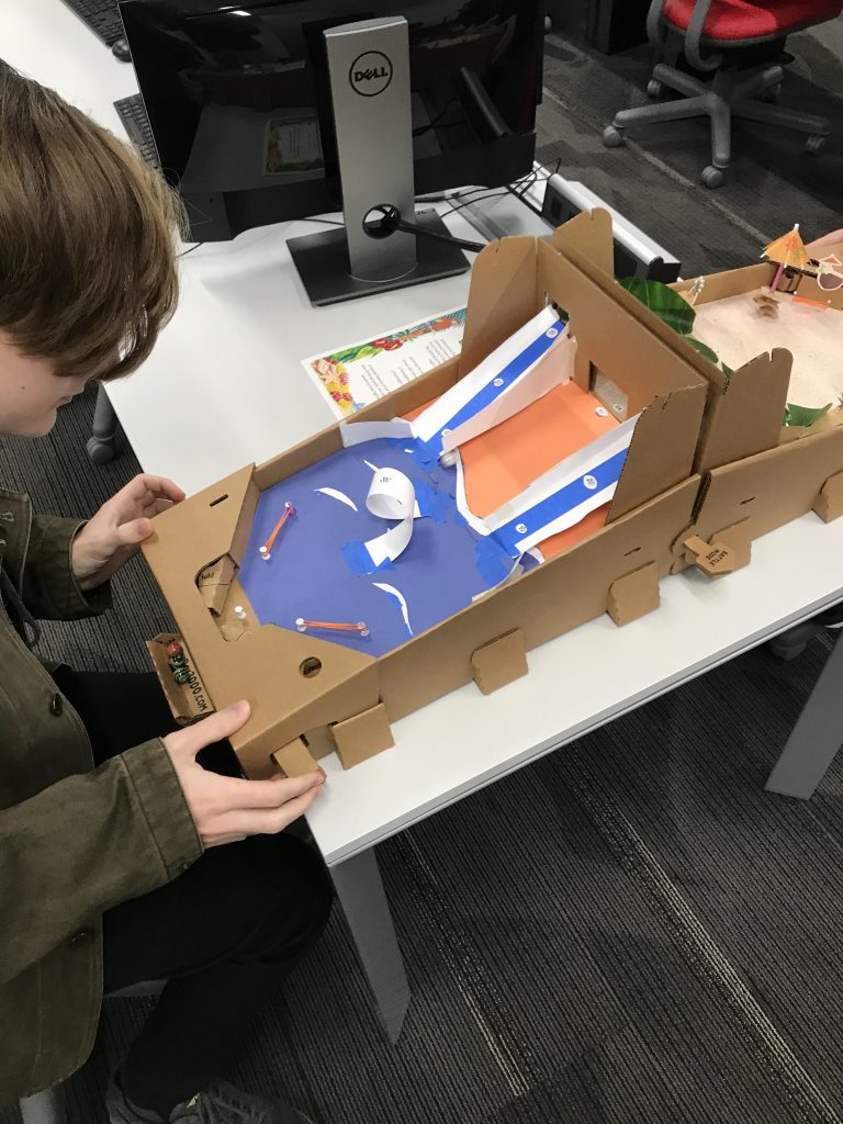
On the theme of the board we got high praise, both sides capture a beachside aesthetic, but Alex went the extra mile and got a variety of nice aesthetic touches that added to the theme, specifically the leaves used as ramps, the cocktail umbrellas used in the spinners, and the sand-looking textured paper. Our features all mesh with the aesthetic, and we got verbal praise for that as well.
Despite some of our notable hiccups, the board was playable and the class was generally receptive to our take on a laid back form of pinball.
Kent’s assets were obtained through the kindness of our classmates and the Magic Center office.
Alex’s assets were found at these references
Sand Reference: https://www.apartment-cassis.com/wp-content/uploads/2017/07/sand-background-.jpg
Palm Tree Reference: https://www.pinclipart.com/picdir/middle/0-4586_sticker-tree-clip-art-transparent-palm-tree-emoji.png
Tropical Rule Sheet Border Reference: https://i.pinimg.com/originals/40/ed/95/40ed954446c1b4c61116ac66ddc5313c.gif

One big problem with the ramps on my side was the size of the playboard itself. I noticed while playtesting that the ramps made it hard to reach the other side. To fix this, I’d have to extend the ramps further down the playfield. But with such a small playboard, making this fix would have taken up a lot of space and changed the design. The wall in front of the plunger was placed in order to stop the ball from being shot directly up the ramp, however, this did interfere with the relaxed play. I think many of the problems with our designs could have been fixed if we had a bigger playboard. But regardless, they came out really nice and it seems like they were enjoyed by the class.