Paradise Island – Battle Mode Pinball Design

My battle mode pinball design is called Paradise Island. The goal for my battle mode was to introduce a fun and relaxing theme that make players feel as though they are on a tropical island paradise. Inspiration for this idea came from the fact that I wanted the two playfields to transition into one another. What I mean by this is that each field will represent a unique scene of the overall theme I’m going for. This will give each player a unique experience, regardless of the design layout of each side. Eventually, I focused on a tropical beach/tropical water theme for the two sides because I thought implementing these would be very fun and look nice in the end.
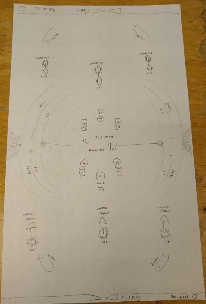
After doing some research into layouts for tropical designs, I eventually came up with the above battle mode design. Keeping my tropical paradise design in mind, each playfield will represent one scene of the tropical paradise, either the water or the beach. I made each side relatively similar in design layout because I didn’t want one player to have an advantage over the other. I also added ramps to each side, with points for each entrance, to give players an incentive to travel to the other playfield.
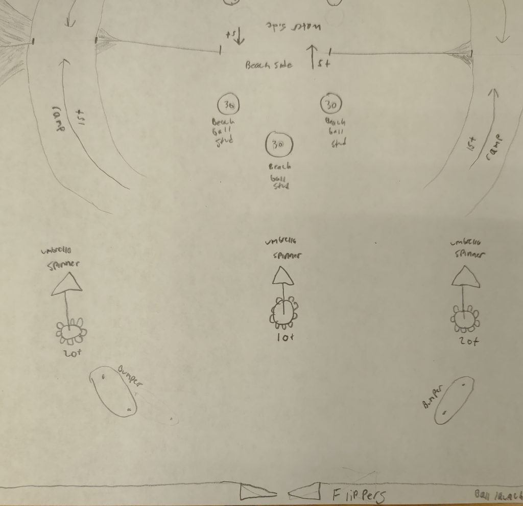
On this side of my battle mode design, I focused on a relaxing tropical beach scene. The studs at the top represent beach balls that the player can hit to get a score of 30. I gave them this score because they are relatively hard to reach and there isn’t much bounce back from them. In the center, I added three spinners with cocktail umbrellas for added fun when they spin. These are ranged from 10-20 points based on positioning. Lastly, I added some bumpers near the bottom to help guide the ball. This side, although not cluttered, will have a lot of design appeal added to give the player many things to look at as they play.
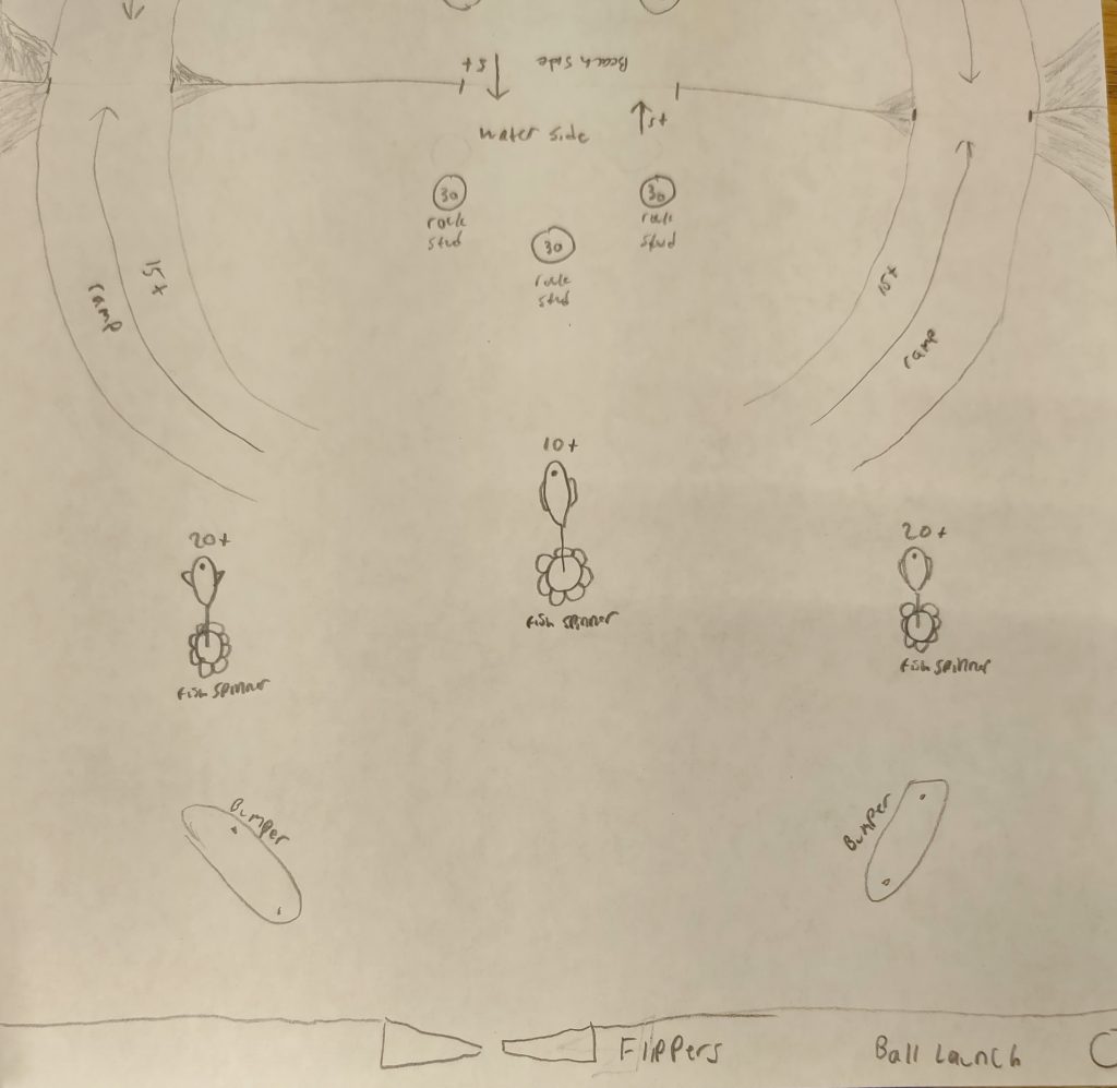
The other side of my battle mode design represents a tropical water scene and is very similar to the first playfield. However, instead of beach balls for studs, it uses rocks/sea shells, which ties into the water aspect of the playfield. Each spinner is decorated with tropical fish as well. To distinguish this playfield from the other, there will be added decoration, which will allow each player to feel as though there is a unique experience to each side, regardless of the similarities.

After giving my presentation, I got very little feedback, however, I did get some comments. One of my classmates asked why I decided to make the battle mode so relaxing. I decided to do this because I have very little experience making pinball machines. If I introduce complex mechanics before I even understand how to make a basic pinball with flippers, it could end in disaster. I also think making the game relaxing fits better with my theme of a tropical island, where you’d vacation to get away from your daily stress. However, I might consider adding simple mechanics to give players more goals while they play. This could be something like hitting cocktail spinners a few times for a bonus or hitting playfield decorations in a specific order. Regardless, I am looking forward to implementing this design at some point in the class!

Tropical Island Reference: https://i.ytimg.com/vi/q0ugLbzdmqc/maxresdefault.jpg

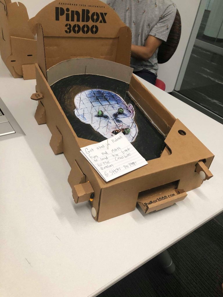
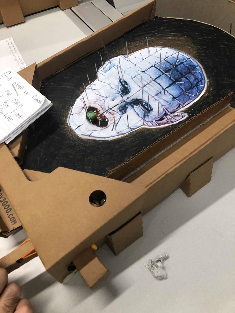
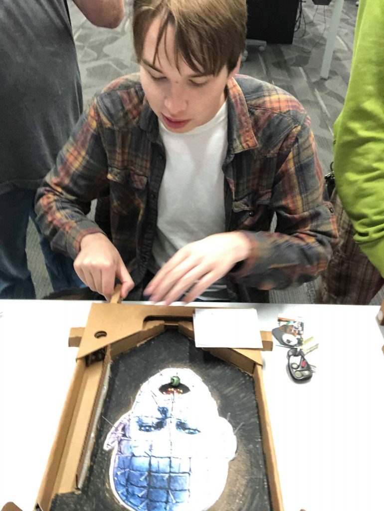
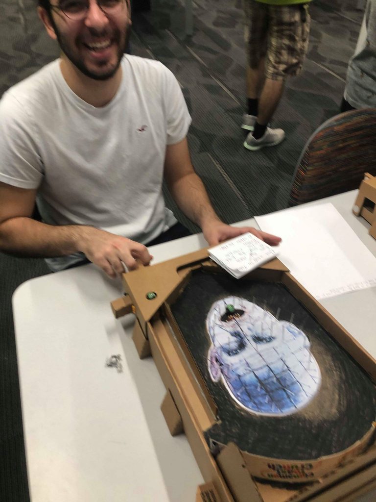
Hellraiser Post Mortem

I found this machine was somewhat tedious to build. once I had the basic Pinbox set up, I spent most of the time slightly moving pins and play testing. A lot of the time was me trying to collect data and probability on how many tries it would take to successfully make the marble into a spot. Overall though, I thought it was a fun experience to build this machine. It was very satisfying to have a finished machine on Tuesday, and I think I’d like to spruce up my machine based on feedback I got on Tuesday.

I received a lot of good feedback on this machine during the playtest. People generally liked how I included the theme in the machine, but a few people suggested ways I could include more from the Hellraiser franchise (ie; using the cube from Hellraiser one as the drain, other cenobites on the back and sided boards etc). The piece of feedback I received the most was the pin placement around the eyes. Basically, it’s very hard to get the ball there and there’s a few pins around the eyes that look like they’re close enough to catch the ball, but they’re just a little bit longer. This was very frustrating for a lot of people, so after the playtest I changed the pins layout to be close enough to catch the ball.

Another piece of feedback I got is that some players wanted for their to be more for players to interact with on the playfield. I think adding some additional obstacle/mechanic other than the pins would help with playability and make the game more interesting. It’d be a challenge to do this while keeping the current theming, but I think it’d be worth finding a solution. I think that’s the thing I’d change if I were to make this machine again. While I like the simplicity of just the pins, I found the other Bagatelle machines with more features/rules/mechanics to be incredibly fun to play and I kept wanting to return to.

The only source I used was the 1987 Hellraiser poster which is where I got the pinhead art from.

Reach for the Star: Cast Party

Making the Game

If you enjoy your work than you’ll never work a day in your life. Which apparently means theme your game on anime and a coincidence. But it was fun to make because of the choice of theme, so it wasn’t a terrible idea.

Starting with the theme and design that went into making Reach for the Star, having a theme made it really easy to place pins. All of the historical examples start to blend together after awhile, since the bulk of them are not strongly themed. There’s like 4, or 5 different patterns of pin placement, and sometimes divots too, and that was it for bagatelles when you break it down. My original design was quite boring, and quickly scrapped once I had my theme of Revue Starlight. I could use the theme to inform my design, so in an instant I had a unique pair of scoring zones in the form of stars, and a pachinko esque series of sand dunes.

Next up is the background, which worked better than I was afraid it’d end up. I decided to print each layer of the background as a separate item, cut them out, and glue them into place. The biggest draw back of this method is the time spent making it, as each piece has to be cut out by hand with a pair of scissors for broad cuts, and a blade for details and tight curves. And after cutting, was carefully gluing and positioning each piece. A little tedious, but overall not bad once you draft recruit a friend to cut things out for you.

Special note goes to the Starlight Logo in the middle of the playfield, which I drew in pencil with a compass and straight edge. Just to find out the marker doesn’t fit into the compass. I didn’t trust my own hand so I begged asked that same friend to trace over the pencil for me.

That left two things left, the spotlights, and the pins. Going off script, I decided to make the spotlights into toys instead of scoring zones, partly because the prospect of cutting holes into the board was much easier said than done, and I realized might not have had a net positive effect on the board. The only bad thing about the toy placement is that they’re too close to the edges, and could get marbles stuck on them unintentionally. I tried to mitigate this, but there was only so much that could be done on the left light.

Anyway, once the lights were placed, all that was left were the pins. And they were a time. One pin placed with bare hands and I had a moment of despair, thinking it would take two minutes per pin, with extreme effort taken to not pierce my own hand trying to punch through the cardboard. But then I realized I had a thimble, which was the real MVP of this build. It turned placing a single pin into a matter of seconds instead of minutes. Again deviating from the script, I replaced the holes with pins, as it would be able to save on time and the testing I had done at that point revealed the pleasant ‘plink’ sound the marble made when it impacted the pins. Between those two facts, I deemed pins to be a superior option to cutting holes in the playfield.


Playing the Game

Overall the playtest went well. So well in fact that there was no negative feedback at all. Notably, the sound and placement of the pins was a favorite among feedback givers. Another liked the commitment to the color scheme. The closest thing to negative feedback is one player not knowing what the spotlights do, which is to say they aren’t supposed to do much. I suppose I could have assigned a point value for hitting them, but other than that they exist as decoration more than anything.

What Would I do Differently

I’d adjust the placement of the spotlights, and make their point of contact cleaner so it both looks and plays better. I’d consider installing a proper deflector at the end of where the plunger fires the ball to make it a touch more consistent, but the current one made of pins performs adequately. Lastly, I wish I had the time to install cool things like literal bells, or have improved graphics, but time was working against me, as there was plenty to do outside of class as well. Overall, I am satisfied with Reach for the Star though.

Sources

I actually did draw each of these on my own based on my memory of the show, and did not get to adding any character toys, so I guess there’s nothing to put here?

Volcano Valley (Bagatelle) Post Playtest

I learned a lot during the creation process of my bagatelle game. I thought that once I had a solid idea in my mind and on paper, that transferring it would be a fairly easy step and that I wouldn’t need to go through too many iterations. I was quite wrong, as designing proper placements for the elements and play testing all the iterations took hours. Once I had a decently refined process for creating the game elements I needed, it came down to just a matter of testing with my roommate and figuring out where things should be to make the game more interesting.

Feedback:

Positives:
-Strong theme
-Ramps and movement work well
-Simple mechanics
-Pocket placement is good
-Good flow of the playfield

Negatives:
-Ball shoots out of playfield frequently if shot too hard or at certain angle
-Point values should be adjusted to better reflect difficulty of certain pockets

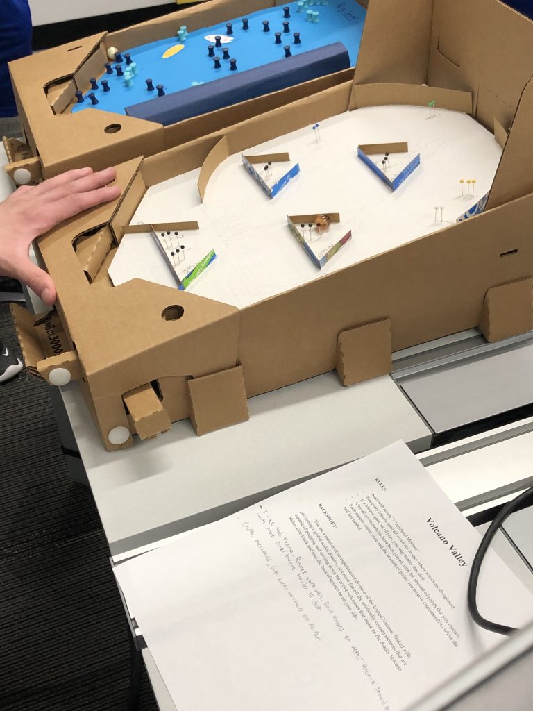
Volcano Valley being played by a fellow student.

Post Playtest: Train Game

Trains are cool and good.

This is the thesis of my bagatelle design, which, among others, was played on Tuesday last week. I had wished to have more theming, as I thought the playtest was more of a test of design rather than aesthetic, but c’est la vie.

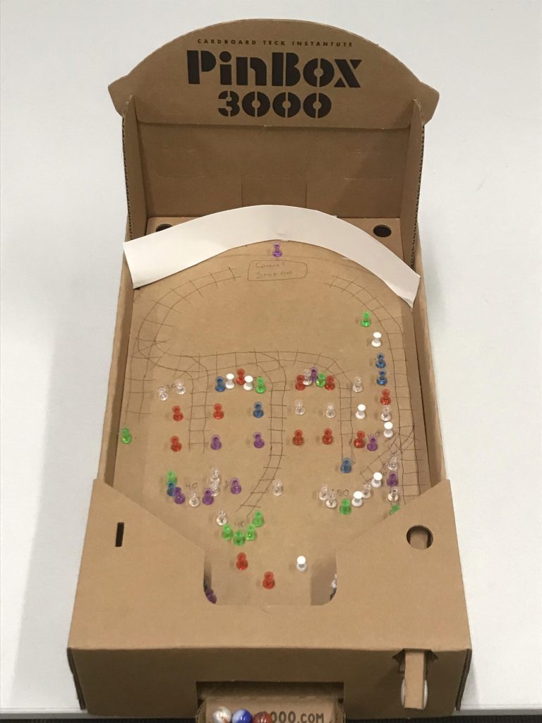
Still shot of the machine, with a bit of the theming I had wanted

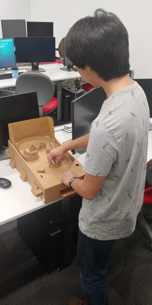
I had a lot of fun assembling the PinBox 3000. I found the process almost therapeutic. Punching out pieces, folding the cardboard, sticking them together, it was very easy to follow and felt near painless to get the thing together. As for the design of the board, I wanted to take the theme of “train” and implement it on the board. The station peg at the top is what the player is aiming for, if you hit it, it’s easy to go down the different “tracks” that have the different pockets for scoring. An easy to follow metaphor, it adds a bit of level design and depth to the simplistic gameplay.

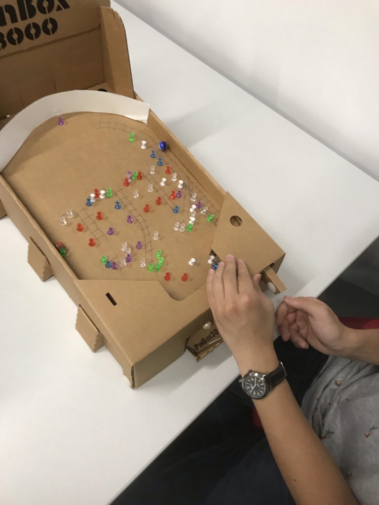
Dakota plays the train themed bagatelle.

As for feedback I got on the design:

Theme

People seemed to like the theme, verbally people told me they liked how the theme meshed with the design a bit. They also quipped my quip about “Trains are cool and good”. It seemed though the art wasn’t as developed as I had wanted people were still able to connect it with the theme.

Implementation of theme and features

People really liked the implementation, with someone nearly directly quoting how I intended that it was cool how I had implemented the “station” into the game. The fact I expected the player to be a bit nuanced with the launcher was noted.

Playability

The reaction was a bit mixed, some said that the shots were satisfying and I had a good eye for placing them. Others commented that it was way too easy to gutter the ball, which was true.

What you’d do differently

I’d like to have made the art more developed. That would have added a lot to the game and the train theming, though I’m glad that the theme wasn’t lost on people.

I got all of the push pins and poster board for my machine from the office supplies in the MAGIC Center.

Postmortem: Second Thoughts

As with most projects, I had expected to not stick with my initial prototype designs and make changes to it as I went along; however, what I didn’t expect was how much I would be changing it.

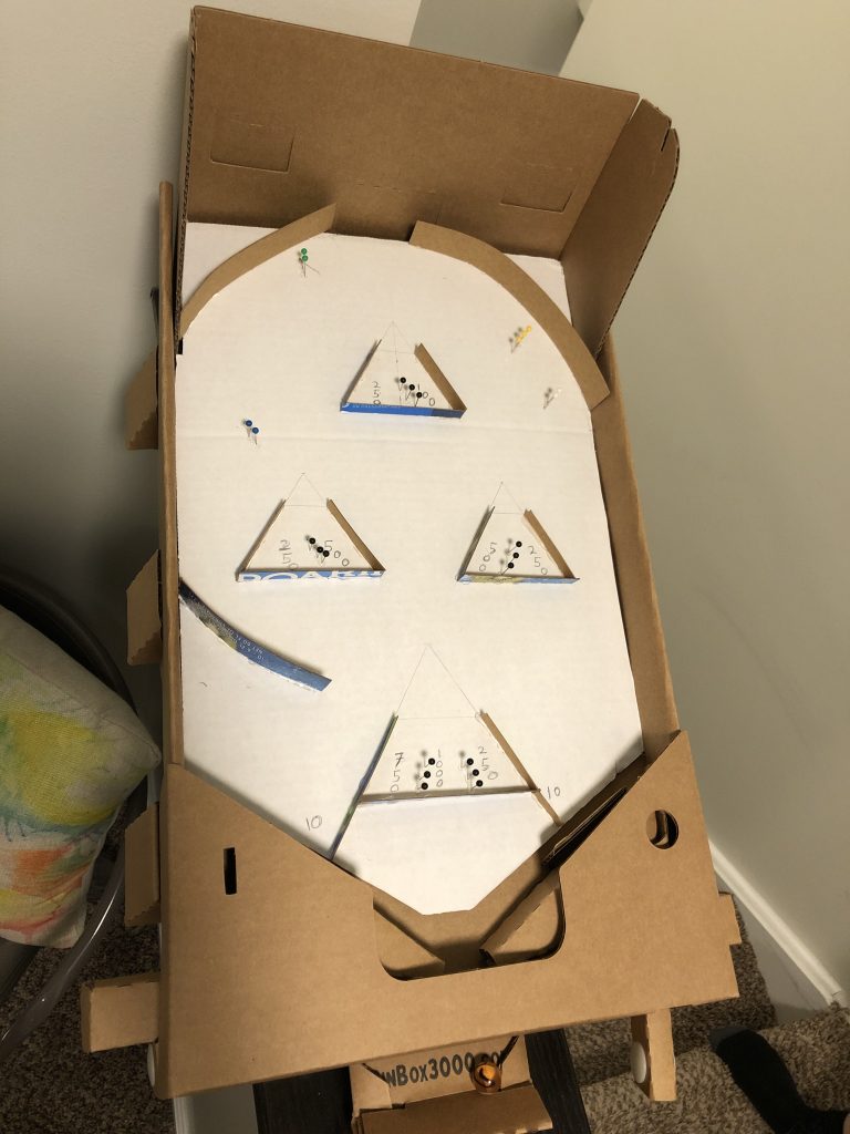
The final build I had settled on

Designing & Building

My initial thoughts when designing the playing field was to keep the base mechanics of the game the same while adding in a few additional elements in the form of ramps that would complicate the gameplay at the same time.

As I started to build and pseudo playtest, I realized that there wasn’t something that was quite satisfying as I imagined it would have been with the ramps. After some additional brainstorming and more testing, I had come up with by combining the functionality of the curved ball catchers and ramps.

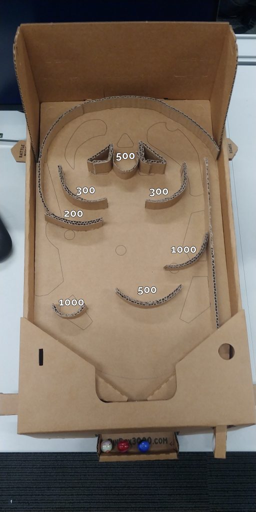
Although I had forgotten to mark them for how many points they are worth, every single curved ramp/catcher is worth points while the top ones also function as ramps for balls to interact with and users to use for skill shots.

Once I had figured out how to remedy my discontent with the design, finishing the build wasn’t too hard. But if given the opportunity to build another. I’d like to build it by 3D printing instead of working with cardboard as getting the ramps to have a nice curve to them to maintain a natural flow when interacting with the balls took a lot more than I had bargained for.

Feedbacks

One of the most mentioned feedback was what seemed like an incomplete theme or the lack of one. I suppose this was because I had been to busy playing other peoples’ builds and wasn’t there to explain but my theme was to keep things simple.

I wanted to keep my final build plain and simple to mimic the simplistic builds of earlier bagatelle machines that were just wood and pins; as well as making sure the players would be able to completely focus on the game with no possible distractions at all.

Otherwise, it seemed like everyone who had tried playing was satisfied with how the game plays out and how the ball interacts with the ramp/ball catcher fusioned elements.

There were a few comments that pointed out the lack of points, but as mentioned above, I had unfortunately forgotten but would have been as shown by the image below. The rules were that players would get 3 shots to get a high score and if a ball fell through, they get to shoot it again.

How the scoring would’ve been

Results

Overall, the machine was still playable with everyone who had played it trying to get the ball in the bottom left pocket and either succeeding or failing and there isn’t much I would do differently other than the already mentioned changing the material I would work with to build if given the time and opportunity.

Carnival Speed Runs

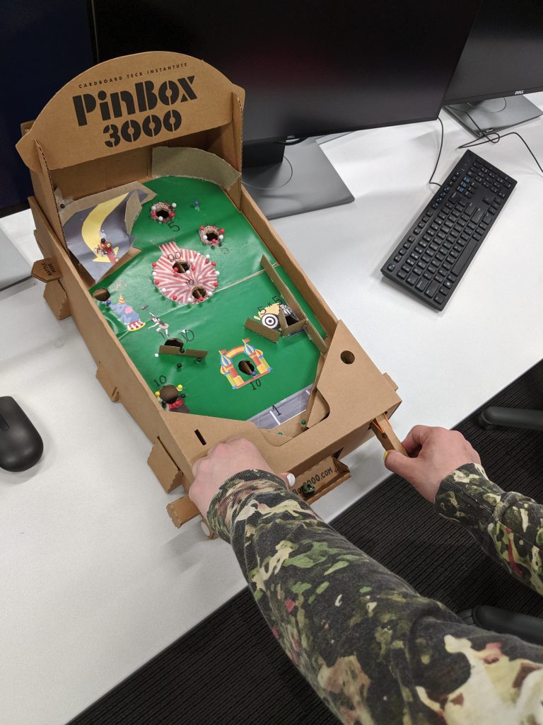
The pinball machine

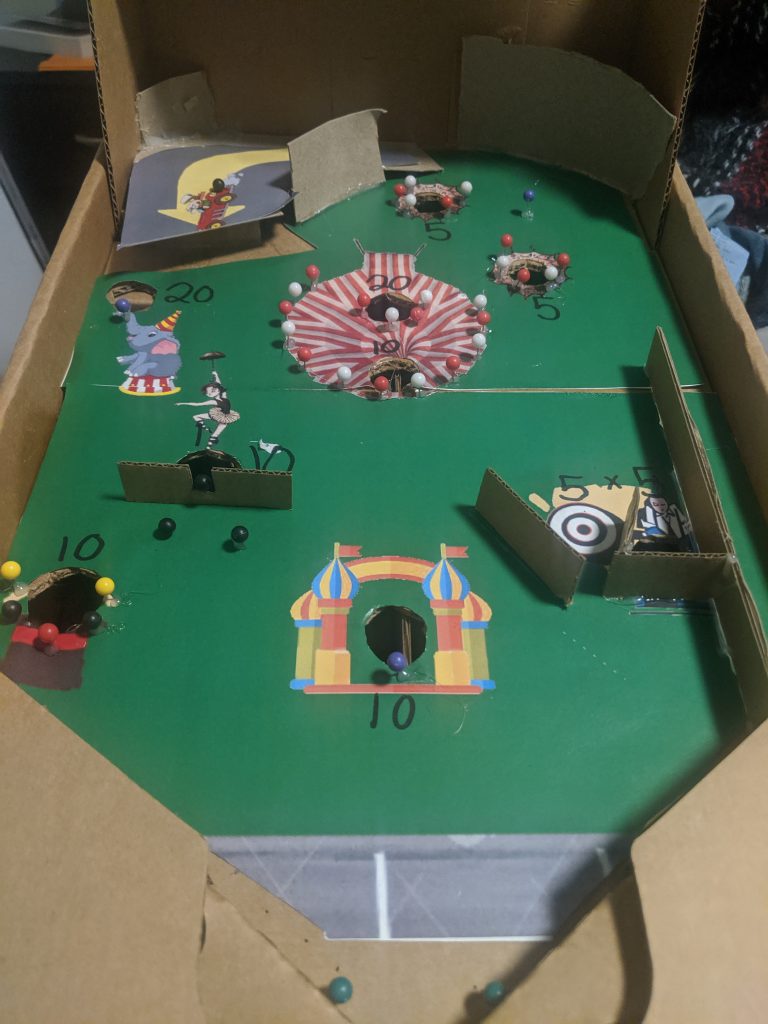
The bagatelle machine was interesting to design. It was nearly a pinball machine, but had some differences that I had to design around. The biggest one was just not having paddles. This means that one ball will only be on the field for a few seconds, so I had to design around making that time it was on the field a fun experience. In terms of mechanical aspects of the machines that I had difficulties with, one of the challenges was making a seesaw-type mechanic. This was actually one that I was not able to finish, but I know now how to do it in future machines. The problem that came from this is a bit difficult to put into words, but the essence of it, is basically that the see-saw would get stuck if two ball would hit either side. The solution to this is to put the seesaw at an angle so that only one ball will ever be able to be in the see-saw.
Another challenge faces was building the ramp, I knew that if I made it too high, the player would never be able to get the ball onto the ramp, and if it was too low, it wouldn’t feel like a ramp. I think that overall the ramp came out fine, although it could have used a bit more hop to it.

Playing Carnival Speed Runs


Based on the feedback, I think the pinball machine overall had a decent idea, and used unique mechanics that people enjoyed. The problem lied in the implementation and some placement issues. The way the ramp was layed out, it made it so that if the ball didn’t go off the ramp, it simply went right back into the launcher area. This meant that players were getting a bit frustrated if they did this more than twice. It was also quite difficult to get the ball anywhere other than on the ramp, because you needed to know the physics of the field very well to get it to the right side of the field.
If I were to make a second version of this field, I would remove one of the top-most holes, as well as shifting the ramp to a be further down in the board, and add some pin obstacles on the upper area.

I used Google to find all my assets:
https://imgur.com/fYTYWUB
https://www.canstockphoto.com/cute-circus-elephant-with-a-striped-ball-47105501.html
https://www.123rf.com/photo_110851024_stock-vector-rabbit-in-hat-magic-hat-with-bunny-ears-vector-flat-illustration-on-white-
background-.html
https://kicks105.com/dunking-booth-set-up-at-angelina-college-get-that-frustration-out/

Post Playtest: Bar Games Bagatelle

Overall a lot of people tried my game and enjoyed it and I only had a few major issues that would be changed if I had more time to work on this.

My game turned out fairly well with a lot of great pieces that all contributed to the theme.

Building the machine was a lot harder than I originally thought it was going to be. All in all it took about 5 hours to build, with a lot of just trying things, them not working, then trying again. The hardest thing I had to build was the spinners. While they worked ok, the straws they used were too big when compared to the pins causing them to angle and get caught. This issue would cause them to catch the ball and not let the balls fall into the designed pockets.

During the playtest I got a lot of positive feedback. The biggest feedback I got was how great my theme was. As I used cards and other things to make it really pop, my theme was very well received. I think with the time I spent to make each of the objects look like they belong was really well used and nothing looked like it was there just to be there. For example, the guardrail was either made completely out of cards, or carboard covered in cards. The biggest negative feedback I got was how my spinners and bumpers did not work super well. Every once in a while they would get stuck or the ball would bounce over them. This caused some break up in the flow of the game, which I agree was a major issue.

If I could have more time I would lay down the construction paper down first using spray adhesive as it would require less precise cuts and would not allow bumps to form allowing the ball to jump. Another thing I would do differently is the construction of the spinners and bumpers. They both were not super well designed and with more time I feel like they could be very fun to use instead of a hassle.

All assets were created by me minus the cards which was just a generic bicycle deck from Walmart.

Big Surf – Playtest Reflection

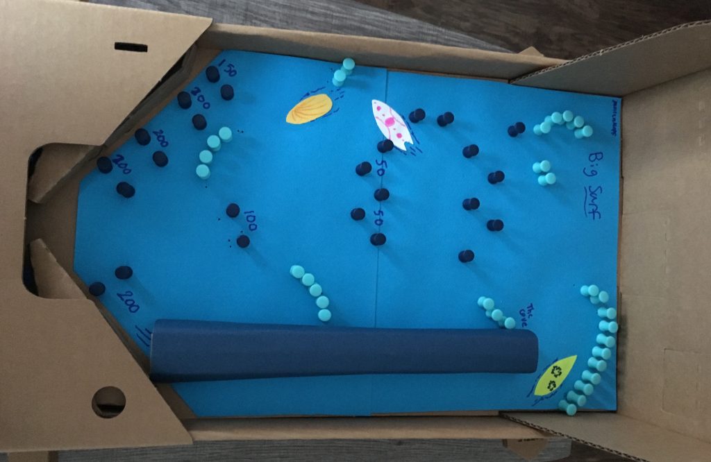
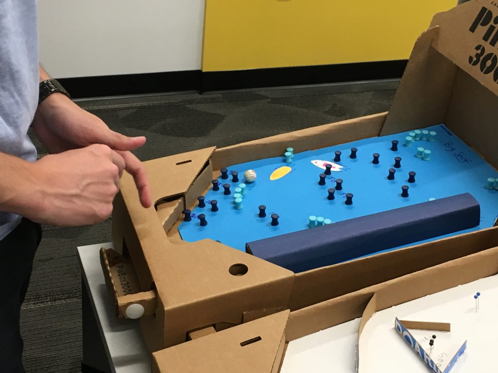
Big Surf was a fun bagatelle to build – in particular, I really had to think outside the box in order to determine how to design the pin “waves” the ball could ramp off of in a way that was fun and feasible.

Playtest Feedback

Theme

Many playtesters liked my theme and color scheme. One of the big challenges I faced besides making the “waves” was how to best represent the theme and finding materials that would go with it. Luckily, I was able to find some pins that came in different colors that matched the style and they ended up working well for gameplay too. Based on this, I will continue to put effort into theming my future designs.

Implementation of Features

Overall, the implementation of my features and point system seemed to work well. I got a suggestion to use paper and hot glue for the ramps instead of pins so it would be smoother and more wave-like.

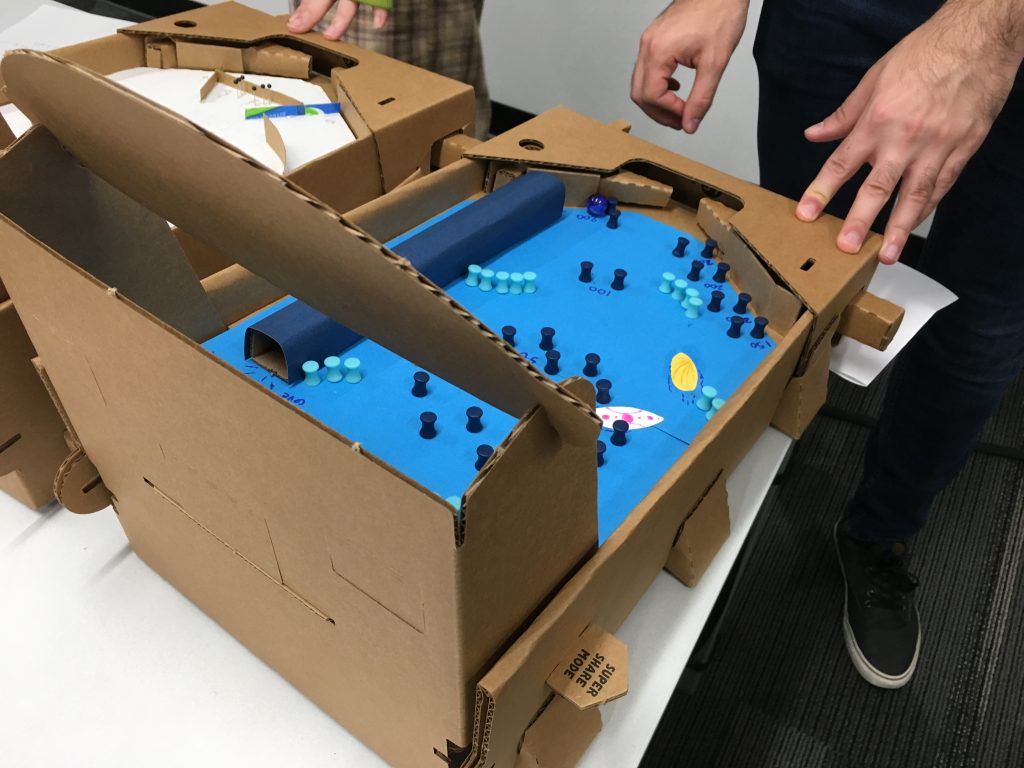
Originally, it wasn’t my intention to have a tunnel (referred to as “the cove”), but I felt it provided an interesting challenge when I was testing it on my own, so I kept it and added a scoring area for it. A lot of people liked it based on the feedback I received, though it was very difficult to use because the top of the tunnel lifted above the playfield and the ball would get stuck on it.

Playability

Besides the tunnel sticking out above the playfield, the rest of the machine is easily navigable and players can get to all of the areas I designated for points. There are places that are easier to get to than others, which was my intention and it worked well from what I observed.

What I Would do Differently

I would have liked to refine the style of the board a bit more and work on a better solution for the “waves” that more so matched my concept. Overall, I feel like this was a very successful playtest and the feedback I received was quite positive and constructive.

Assets

All of the features on the board were done with generic materials I purchased from Barnes and Noble. I drew the surfboards using clipart from Google Images as references, but I didn’t print out any graphics or copy the exact designs from the clipart.

Target Practice: Bagatelle Playtest

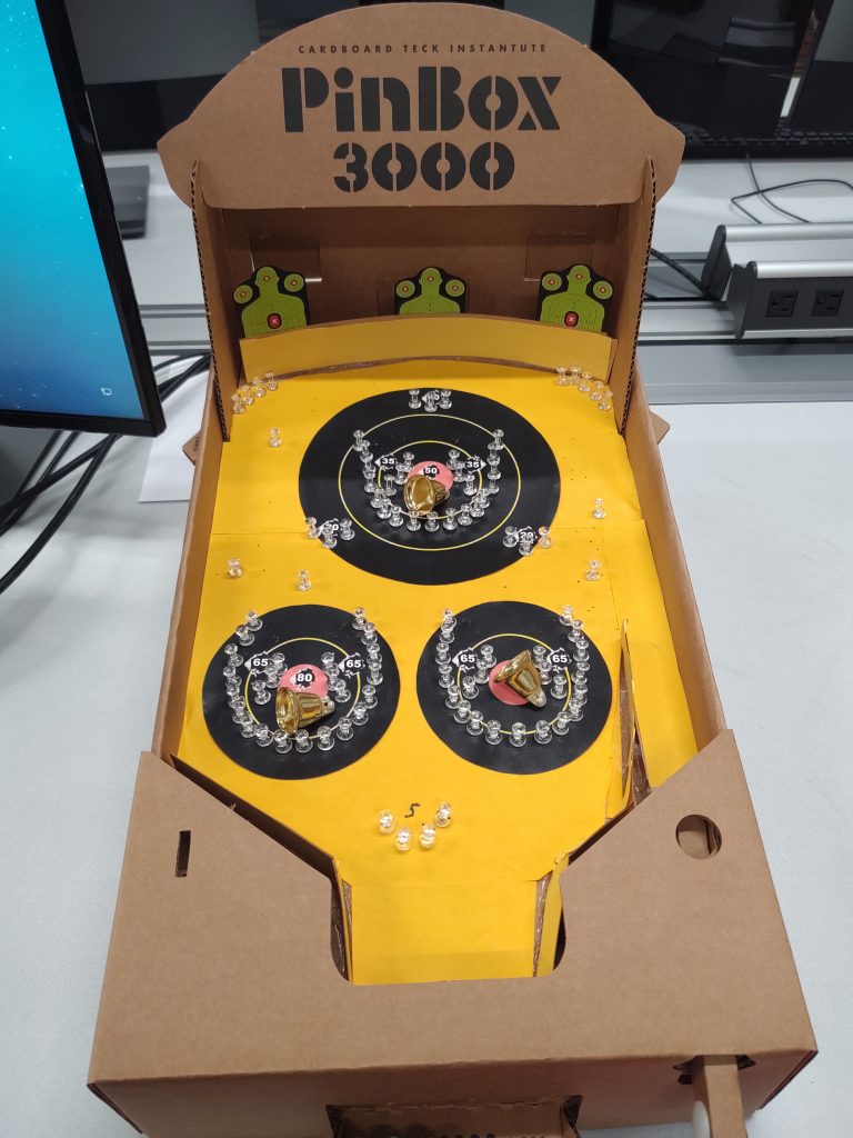
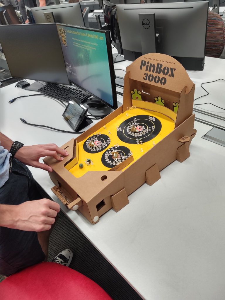
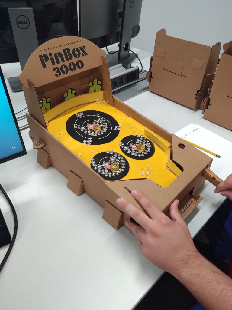
Today, in class, we playtested the final products of our bagatelles. For my bagatelle, I was going for a shooting range theme and chose to show it throughout my design. I used cutouts of shooting targets to line the background and created targets to mark the playfield itself. To align with the theme, I designed the background color to have similar colors to a sheet of shooting range paper.

Building the bagatelle itself was a bit of a painstaking process. Since it’s been so long since the last time I’ve worked with arts and crafts, the playfield took longer to make than I had hoped. For example, I struggled with applying the paper backing and the divider walls. However, after some hard work, I managed to implement them the way I had hoped. After adding the background materials, I worked on creating the targets and aligning the pins perfectly around them. This process took a while and required lots of testing, but was worth it in the end.

While playtesting my board, I received a lot of feedback in regards to the theme, playability, and implementation. One of the top comments from my peers was how well my board was themed. They loved the target backboard, as well as the targets, thinking they added a nice touch and tied together the idea I was going for. In terms of playability and implementation, many of my peers mentioned that the game was fun to play. The separate sections divided the game up and made it feel as though you were actually trying to hit the targets. They also mentioned that the implementation of my push pins and bell worked well together, even though the bell wasn’t very loud when the marble knocked into it.

Despite all of the nice comments about my bagatelle, there were a few things that I’d do differently if I had the time. Some of the comments from my peers mentioned the scoring and how some of the targets were harder to hit than the others. If I were to do this again, I’d fix the scoring so it accurately represented the difficulty of reaching each ball catch. Other than scoring, I’d fix the bells and orient them so that they make a louder noise when the marble reaches the center of each target. Regardless of these fixes, I believe my bagatelle came out much better than I could have hoped!

Shooting Range Target Reference: https://i.ebayimg.com/images/g/sBMAAOSwUFtZZ7rR/s-l400.jpg

Shooting Range Enemy Target Reference: https://reviewfinch.com/i/azn/81vztBMXfGL.SX500.jpg

Bullet Hole Reference: https://www.freeiconspng.com/uploads/bullet-holes-png-11.png