Cirque Du Pinball: Simple Virtual Playtest

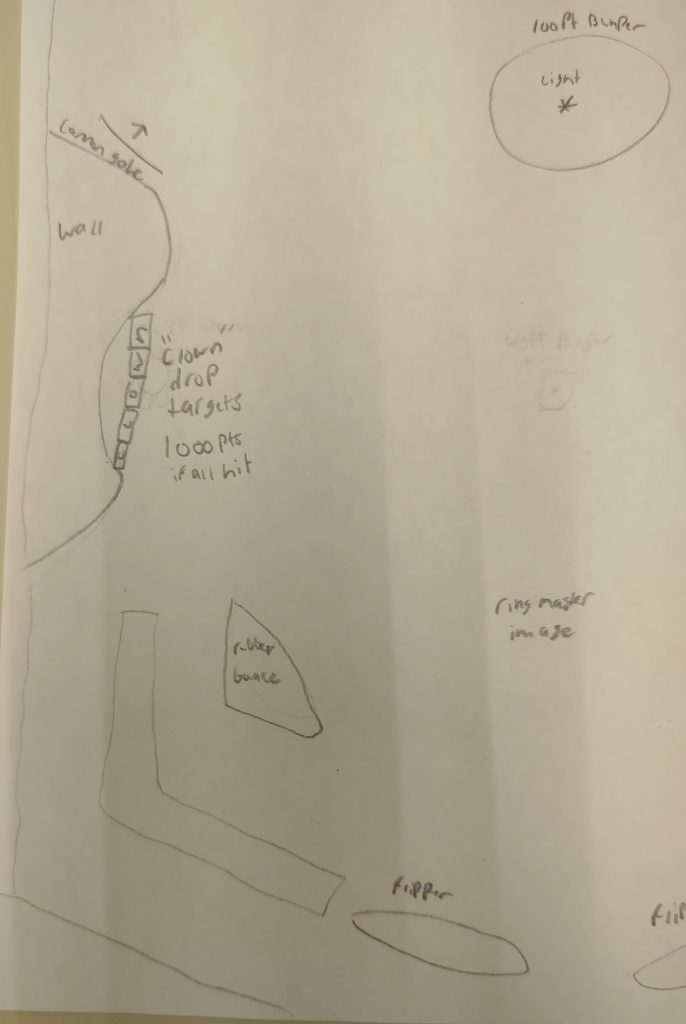
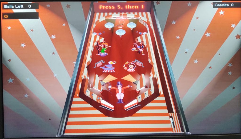
Today, in class, we playtested the final products of our simple virtual designs. For my design, I was going for a circus theme that used the basic tools that Virtual Pinball gave to us. I added drop targets, spinners, bumpers, as well as lights/sounds that were decorated according to how a circus might look.

Making my simple virtual design was not as simple as it would seem. A lot of my time on the machine was spent researching how to use Virtual Pinball. Despite the in-class tutorial and the forums, there is very limited material on the software, especially when it comes to scripting. However, the software itself allowed me to do things that the physical pinbox did not. For example, I was able to add lights, bumpers, and drop targets that worked very well. I used scripting to program them, which took some time, but worked out in the end. For example, I was able to play a clown laughing sound after all the drop targets to a side were hit. Little things like this took time, but made the machine more unique than my physical machines. After programming score and functionality, I focused on adding decorations and sound that fit a circus theme, bringing it all together.
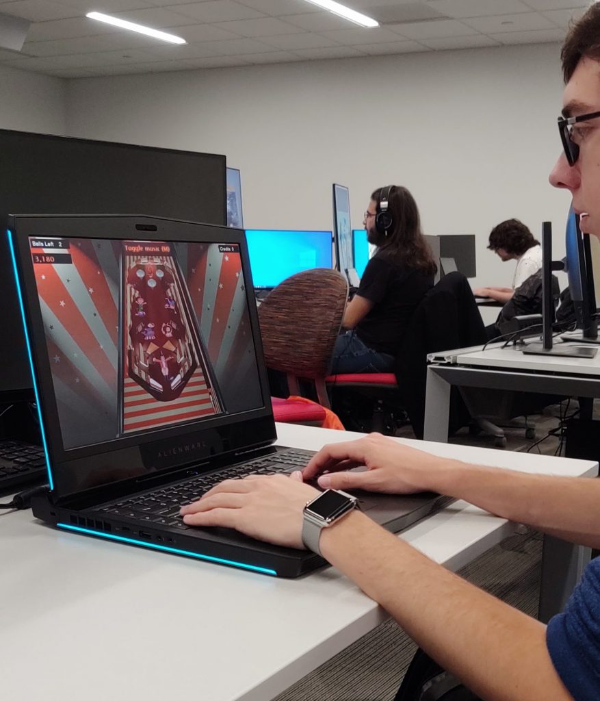
While playtesting in class, I received some feedback about the theme, playability, and implementation of my design. Although only a few people managed to play my machine, most of them liked the visual appeal. The sounds and art fit the theme well and it made the machine more fun to play. With that said, playing the game was just as appealing, but there were a few setbacks. The drop targets seemed to be difficult for players to hit and the ball would often get stuck bouncing between bumpers. Although I intended this area to be a trap to gain score, the implementation could have been a little better. Other than that, the design worked really well in Visual Pinball.
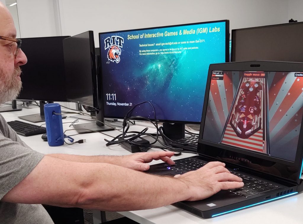
If I had to redo my simple virtual design, I wouldn’t change much. My design changed a bit from the start, but it worked very well as a simple game to just have fun with. However, if I had to change something, I would probably make the machine a bit more simple. I put a lot of time into the machine and added some features which were probably not necessary for the requirements of this design. For example, I added the ability to add credits and start the game. I also put a lot into the details of the machine. All of this looked nice in the end, but it was much more advanced than I had initially hoped. Nevertheless, I had fun making it and I look forward to using what I learned on my advanced virtual design!

References

Circus Playfield Image: https://www.google.com/url?sa=i&source=images&cd=&cad=rja&uact=8&ved=2ahUKEwjkts7H_OTlAhXFm-AKHSH2DXcQjRx6BAgBEAQ&url=https%3A%2F%2Fwww.istockphoto.com%2Fphotos%2Fcircus-tent&psig=AOvVaw3xVqfJJQbohutAXyxCj7gr&ust=1573658292863644

White Material: https://www.google.com/url?sa=i&source=images&cd=&ved=2ahUKEwiBweiz_-TlAhUBmeAKHXrfDyIQjRx6BAgBEAQ&url=https%3A%2F%2Fwww.amazon.com%2FPrism-Backdrop-Ravelli-Background-pre-shrinkage%2Fdp%2FB001C6SYR2&psig=AOvVaw2GRKuU4BGi5kYqZBXynvbF&ust=1573659176489747

Striped Material: https://cdn11.bigcommerce.com/s-8715e/images/stencil/1280×1280/products/124200/371235/PSD101__34336.1566493794.jpg?c=2?imbypass=on

SpotLight Image: https://www.google.com/url?sa=i&source=images&cd=&ved=2ahUKEwj5xJK9jeXlAhVvg-AKHcD1AkEQjRx6BAgBEAQ&url=https%3A%2F%2Fwww.pinterest.com%2Fpin%2F510314201510754597%2F&psig=AOvVaw1YzCFFykjaX9ujar2RhtEL&ust=1573662950059096

RingMaster Image: https://www.google.com/url?sa=i&source=images&cd=&cad=rja&uact=8&ved=2ahUKEwiEtrOdpuXlAhWNct8KHfunDNoQjRx6BAgBEAQ&url=https%3A%2F%2Fwww.kissclipart.com%2Fring-master-png-clipart-the-ringmaster-circus-b0h8yw%2F&psig=AOvVaw2VExZ9pmyymFU741OB59L_&ust=1573668654011638

Seal Image: https://encrypted-tbn0.gstatic.com/images?q=tbn:ANd9GcTTn5C6-gODl-x92qVzb29TzkSJc4lzQcCyS04z0o_YOboXYV82dw&s

Lion Image: https://previews.123rf.com/images/comodo777/comodo7771402/comodo777140200002/26051484-carnival-lion.jpg

Clown 1 Image: https://pixy.org/src/74/thumbs350/742650.jpg

Clown 2 Image: https://pixy.org/src/58/thumbs350/581751.jpg

Cannon Image: https://www.clipartwiki.com/clipimg/detail/259-2594951_download-cartoon-circus-cannon-png-images-background-cartoon.png

Letter C: https://images.yaoota.com/XANYP7uN6xxyTEINUIEoZSXBP5A=/trim/yaootaweb-production-ng/media/crawledproductimages/8a8682b8e5bd7d93da6325cad86160620deffe2b.jpg

Letter L: https://images-na.ssl-images-amazon.com/images/I/61Xue5hPgnL._SX466_.jpg

Letter O: https://images-na.ssl-images-amazon.com/images/I/61I7o3q%2BlGL._SX466_.jpg

Letter W: https://images.yaoota.com/JDpa5o9r2SWxa8hC_IIvwm9uUVk=/trim/yaootaweb-production-ng/media/crawledproductimages/905f9d916990e6c32ced209abcb596c0f1cd48d9.jpg

Letter N: https://as1.ftcdn.net/jpg/01/61/76/92/500_F_161769244_K0FiGcGRoB2iGtdk8kfJENaVqcagU5zf.jpg

Circus Music: https://archive.org/details/78_entry-of-the-gladiators_fucik-laurendeau-ringling-brothers-and-barnum–baileys-ba_gbia0000455b

Cannon Sound: https://www.freesoundeffects.com/free-sounds/cannon-10077/

Clown Sound: https://retired.sounddogs.com/previews/17/mp3/704046_SOUNDDOGS__ca.mp3

Sad Trombone Sound: https://freesound.org/people/Benboncan/sounds/73581/

Pinball Alley v2 – Advanced Virtual Design

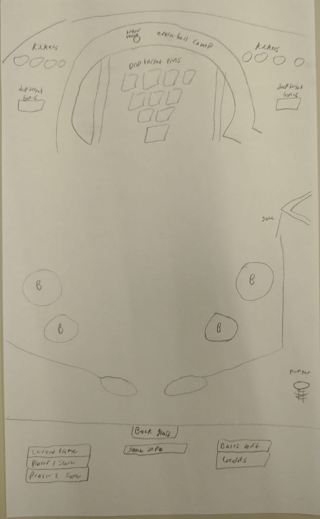
My advanced virtual design is called Pinball Alley v2. The goal for this advanced virtual design is to improve my physical advanced design. I want to create a virtual machine that resembles an actual bowling lane. The machine will be simple in layout, but will have a more advanced scoring system and some extra mechanics for added play. Inspiration for this idea came from my love for bowling and my last physical machine. The physical machine implemented my idea pretty well, but there were flaws when it came to the scoring system and drop targets. I wanted to improve and make a virtual design that felt like a competitive game of bowling between two players. All these ideas led me to the advanced virtual design below.

After reanalyzing my physical idea, I determined ways to make my virtual design better. I would use Visual Pinball’s tools and improve upon the elements that didn’t work too well in my pinbox. I decided to use actual drop targets for my pins, providing a better bowling experience. There would still be a system for returning the ball using kickers and an open playfield for ball control. However, I will make this idea more advanced by programming two player game play as well as extra ball and such. This will add to the experience of the machine as a whole and move it in a better direction than the physical idea.

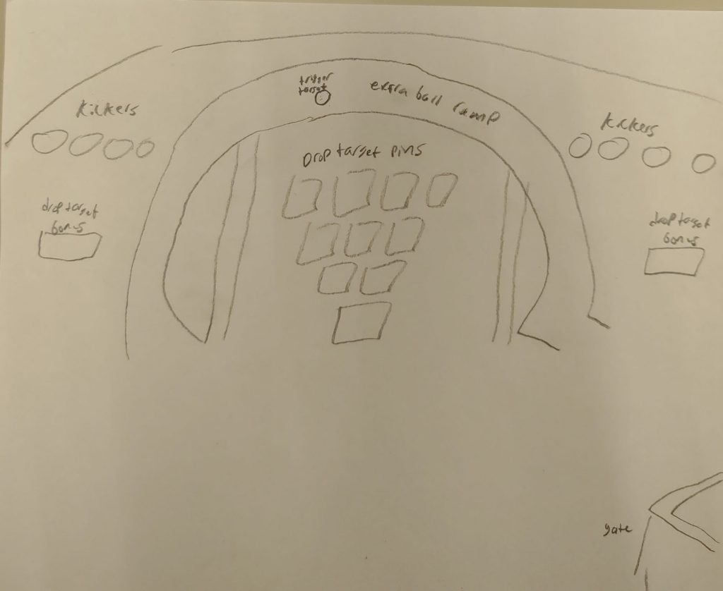
For the top of the playfield, I focused on the actual game of bowling. I wanted the top to resemble where the pins would be located on the bowling lane. They would be represented using drop targets and there would be kickers to destroy the ball if it passed the pins. Since drop targets are a tool of the software, they should work much better than my physical design. I decided that I would allow only 3 frames per game, since 10 seemed too long for play. However, to fix the scoring I made spares and strikes worth 10 points (depends on how many balls were used to hit all pins) and 1-9 for anything else. I also added an improved version of extra ball here. The ramp surrounding the pins would resemble a ball return and would give one extra ball per frame. Using it would provide an advantage over your opponent and due to its location, it is much easier to reach than my physical design. Lastly, I added the side bonuses that will provide an extra 5 points to get ahead of your opponent. These are relatively the same, but I can use text info to show the player they received a bonus.

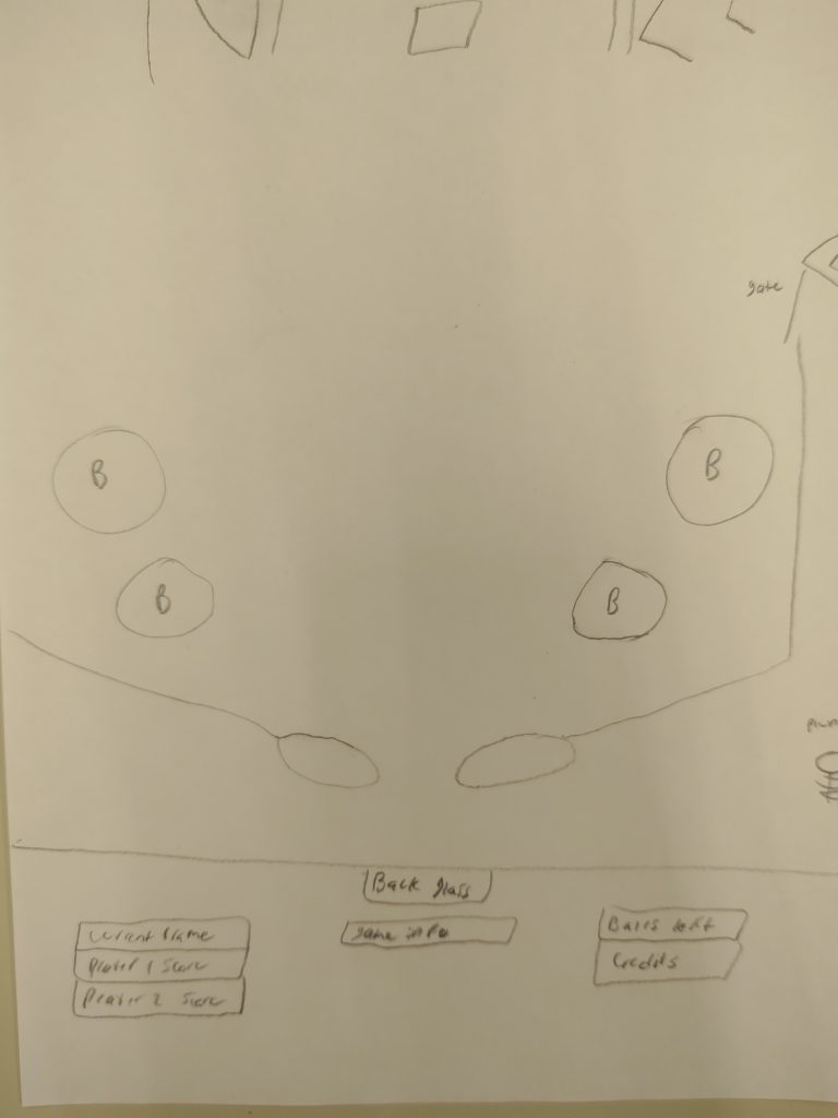
The bottom of the playfield is pretty barren. I left it open because it is important to allow the player ball control as they aim for the pins. However, I did add bumpers to the sides to direct the ball to the flippers, which is an improvement over my physical design. For this specific design, I think it is also important to provide critical information to the player. Since my physical design lacked information, I decided to put it all on the back glass. I will show the current frame, player scores, balls left, as well as game information like extra ball and bonuses. This will make the player experience feel very similar to bowling.

For this design, I was not able to give my presentation because I was traveling. However, I did submit my presentation and heard back from some classmates. The feedback was generally focused on the simple design. Although the design does not look too advanced, I will be programming a lot more for the advanced aspect. This programming will provide a more advanced player experience than my other machines. As I start to build this design, I might change a few things when it comes to physical look of the machine. I like the design, but I want the experience to be unique. I might make the bowling pins surrounded by an overhang like in actual bowling. I might also rearrange the back glass display and write in game rules to make information more readily available. Other than that, I look forward to making my improved and advanced virtual design!

References

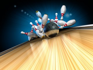
Bowling Background: http://www.backgroundsimg.com/picdir/sm/bowling/backgroundsimg-party-bowling-alley-bowling-pins-bowling-oMm44.jpg

Jet Set Radio Visual Pinball Pitch

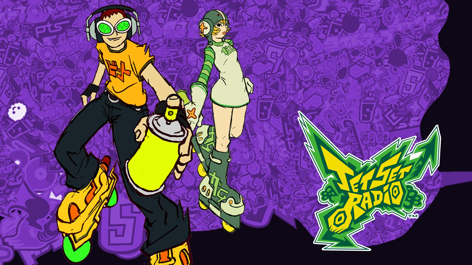
For my first visual pinball project, I wanted something simple that I would be able to implement sound effects into effectively. I decided to theme my machine off of the Dreamcast Skating game, Jet Set Radio. I think the game has a very unique sonic Identity that would be very fitting for a pinball machine. The game also has a very unique visual style, with an early 90s Japanese street wear influence and a graffiti-inspired art style. The game has a lot of vibrant colors that I thought would look nice. This is what led me to choose JSR for my theming.

Jet Set Radio promotional Image (nabbed from: https://www.microsoft.com/en-gb/p/jet-set-radio/bvql7v5txbhb?activetab=pivot:overviewtab)

For my actual playfield, I wanted to heavily include ramps. For me, I find ramps to be one of my favorite playfield-elements in pinball machines. I think they’re very satisfying so I tried to emphasize a fun ramp loop in my machine. I also tried to implement bumpers to fill out the machine.

Orange circles= Bumpers
Green circles=Rollover targets
Squares=Dropdown targets

Now that we’re using visual pinball, I want to make my machine have a focus on scoring. In a cardboard machine, having to count the score yourself is very tedious so I tried to use other sorts of goals/objectives in my previous machines. Now that scoring can be automated, I want my machine to have a fun and effective scoring system, like many classic pinball machines have. My stretch goal for this machine is to implement some sort of multi-ball for my machine, but this will depend on how much time I have.

Burnout: A Visual Pinball Game

For the first Visual Pinball assignment I am making a burnout themed pinball machine.

The design sketch for my pinball field

This board is based around the idea of a “race” where the player is tasked with upgrading their engine and beating out the other racers. I want it to flow like this:
1. Hit the relay lane to upgrade your engine.
2. Hit the targets R A C E
3. Pass the the racer by accelerating your engine with the top ramp

Now this mission system has proven difficult to implement, so I think I’m going to settle with the theme and getting the layout of the board done on this one. Perhaps I’ll expand on it with the mission system for my advance Visual Pinball.

Yeti Pinball Post-Mortem

The Yeti pinball machine was a true labor of love. Overall, I probably should have made the ramp out of cardboard and it would have taken less time.the buttons I used ended up hard to push with the ball but still very doable. If I were to do it again I’d buy some more sensitive switches.

As far as layout goes I am very happy with how this plays. The spring was inconsistently responsive at some points during tests, but no one said anything in testing.(Yay!) I wish I could have put some electronics on the second floor.

The scoring system was flashy and cool, but it could have communicated better with the player given more time. Overall though, I am very happy with what I came up with.

Hotline Miami Post-Mortem

After having play tested my Hotline Miami machine, it was very apparent what the strengths and weaknesses were of the machine. The strengths were the visual appeal. I got a lot of compliments on the looks of the machine and was very happy with how it turned out. The EL wire went a long way in giving the machine a unique look and helped capture the 80’s neon aesthetic of the game Hotline Miami. The third flipper was very well received also. People seemed to think it felt very good, which I was happy to hear. I spent a lot of time working on the feel of that flipper until it was just right. The only downside I had with this flipper was that my implementation required that the extra flipper be directly above the left flipper to function properly. This meant I had to sacrifice a lot of playfield space to get this flipper working.

Most of the criticism I got on this machine was with the implementation of certain things. The ball had a tendency to get stuck on the EL wire that lined through the ball return. The ball also could get caught on one masks (the one below the third flipper.) I think I would have redesigned the playfield to more accommodate this space if I could redo the project. It was also much more difficult to get the mask on the top left than I had originally intended. Also the EL wire looks much better in dim or dark lighting than in a well lit room.

Assets for the machine from
Playfield Art from Hotline Miami fan-art by Anu Patten (https://www.artstation.com/artwork/zAQPqZ)
Masks art taken from Hotline Miami game (specifically this rip of the games assets: https://www.artstation.com/artwork/zAQPqZ )
Beard character Art taken from Hotline Miami (specifically, the rip of his asset available on the Hotline Miami Wiki: https://hotlinemiami.fandom.com/wiki/Beard)

Castlevania Postmortem

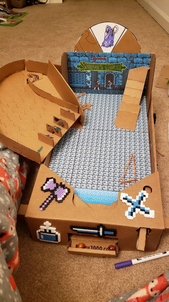
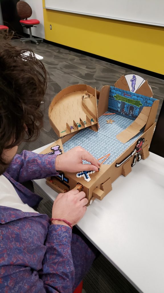
I genuinely have mixed feelings when it comes to this machine. I feel that the idea and concept were very strong, but I didn’t have the ability to accurately portray it with the pinbox 3000. Building the external ramp and table proved more difficult than I though which pushed back the time I could use to work on the other aspects, on top of frequent printer issues that caused the art to have to be manually edited and then colored by hand. These issues forced me to scale back my original design, while keeping the core mechanics in place. For the visual pinball assignments, I intend to build the machine as I originally intended.

Feedback was mixed, a lot of people liked the theme and the boss mechanic a lot, but the ramp leading to the subweapons was way too difficult to hit, so they barely got to play the rest of the machine since they had to spend their time hitting that one shot. They also found the rest of the playfield to be a bit barren or pointless which I agree with.

As I was building this machine, I came up with several cool ideas which unfortunately I could not implement since it would have required me to start from scratch, but if I could, I would have implemented them. One such idea was to have the plunger launch directly into the subweapon ramp so that players always start with at least something. I’d also modify the steepness of the ramps so that players can go up them much more easily. Thankfully, with visual pinball I’ll be able to implement these features and much more, so I’m greatly looking forward to that.

Citations:
https://www.nintendo.co.uk/Games/NES/Castlevania-II-Simon-s-Quest-276610.html

https://www.spriters-resource.com/nes/cv/sheet/8468/

https://kotaku.com/in-defense-of-castlevania-2-simon-s-quest-1835599200

http://nintendoforever.free.fr/Nes/Castlevania2SimonsQuest/Castlevania2SimonsQuest_Soluce/Castlevania2_03_Soluce2.php?lang=en

Cirque Du Pinball – Simple Virtual Design

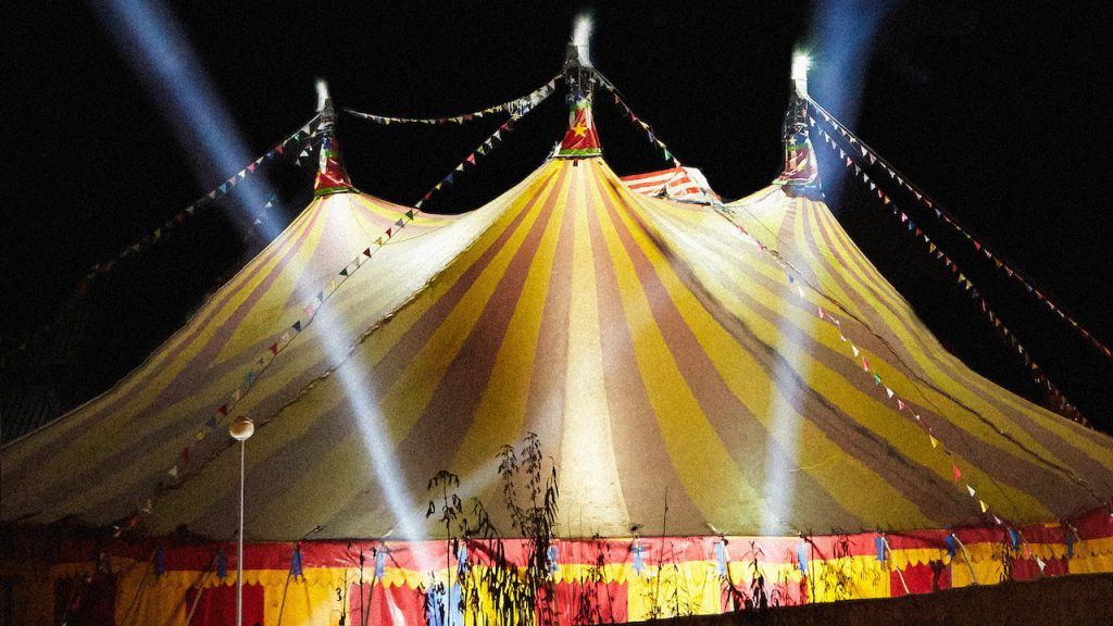
My simple virtual pinball design is called Cirque Du Pinball. The goal for my simple virtual design was to test Visual Pinball and the features it provides when making a pinball machine. I decided to focus on a circus theme for this simple design. Inspiration for this concept came from an idea I had on a previous pinball machine. Since Visual Pinball allows the use of lights, sound, and music, I thought that imitating a circus full of music and fun visuals would be a good way to learn what the software has to offer. I also plan to use this design as a starter for my advanced virtual design, which will be an imitation of my physical bowling pinball machine . This will make it easier when I’m working on a more complex machine with the software.

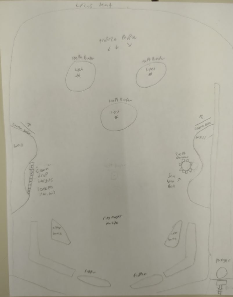
After doing some research into simple pinball designs, as well as circus designs, I came up with the design above. My field will be relatively simple, but will use most of the components provided by Visual Pinball. I have added bumpers, spinners,and drop targets, each of which will have some sort of circus theme. The field is also pretty open, to allow movement of the ball and an easy way to reach areas where points will be gained.

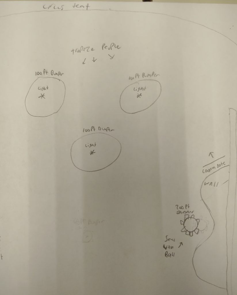
At the top of my design, I have added bumpers to give the player an area to rack up points. Each bumper will have lights and give the player 100 points on contact. On the left side there will be spinners that give 200 points as well as a wall and bumpers to direct the player back into the scoring zone. This area will be decorated to resemble height based circus activities such as the trapeze and cannons.

To the right of my design, I have added drop targets that spell the word clown. When all the targets are hit, they will give the player 1000 points. Other than that, this side is a duplicate of the left and will also help direct players into the scoring zone. At the bottom of my design, there are default slingshots, which will be decorated for a circus theme.

After giving my presentation, there wasn’t too much feedback in terms of my design. However, there were some items that could be fixed as I move forward. I learned that spinners come in specific forms in Visual Pinball and not the idea I had for my design. In this case, I might move the spinners around and add drop targets to both sides. I also might make the design a bit more advanced by adding a credit system and the ability to start the game. This will aid me when scripting in my final virtual design. Other than that, I like where this design is going and I can’t wait to get it started!

Circus Image: https://occ-0-1068-1722.1.nflxso.net/dnm/api/v6/E8vDc_W8CLv7-yMQu8KMEC7Rrr8/AAAABdMm2NEga7lzgtzzxBqolHT7kXfWBy6yuRww2_0PGi6elhoob1xsUipD3tLZSo6msrI9DJuc-4XAHpE0pRyZ9sHSjZFM.jpg?r=c93

Gold Rush Post Playtest

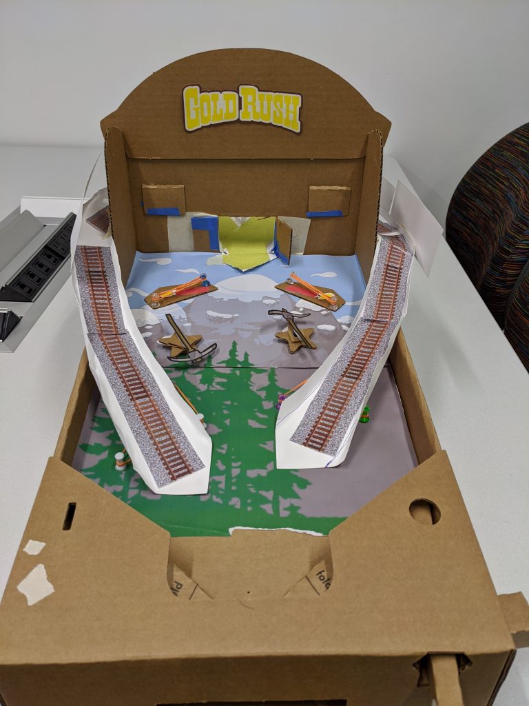
Gold Rush Machine in all it’s goodness.

Gold Rush was a resounding success. I hit all of the goals I had set out to do with the machine. Firstly, the advance element of the external ramps, while not entirely reliable in action, did work most of the time. Second, this was by far my most aesthetically put together machine. I think it captured all the aesthetic nods I wanted to hit and felt relatively cohesive and themed as a machine.

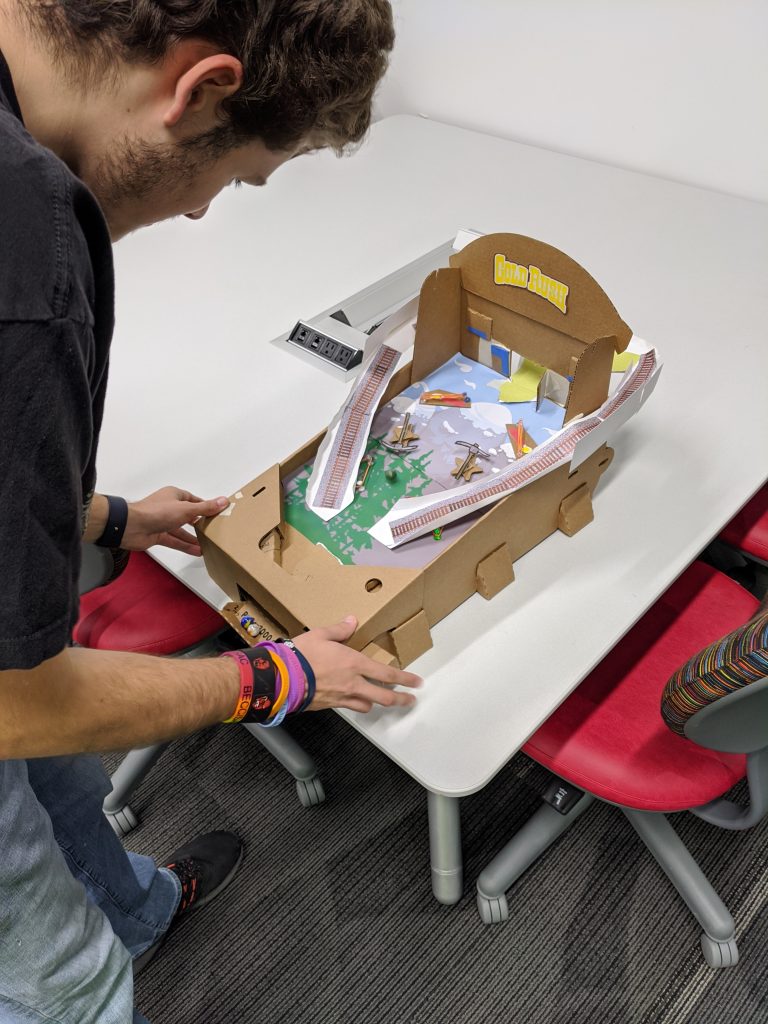
My friend playtesting the machine

On the theme of the board I got high praise, the board captures the Americana aesthetic. The features of the ramps as mineshafts and the silver ball as a minecart mesh with the aesthetic, and I got verbal praise for that as well. The main complaint was that the ball would fly off the ramps on occasion, but every player, save for one, was able to successfully get it up the ramp and through the middle hole at least once. Which was the win condition I had set for the board. If I were to do this again, I’d make my ramps out of cereal box cardboard, which is a bit sturdier and I can easily add walls to prevent the ball from flying off.

Overall, the board was a lot of fun to make and it seemed like people enjoyed playing it despite some minor hiccups.

Sources (modified by myself in most cases using Photoshop):
Minecart Track: http://www.clker.com/cliparts/2/3/8/9/1516823793699516836free-train-track-clipart.med.png
Gravel / Gold:
https://media.freestocktextures.com/cache/93/37/933714c1cab295948dce22e82002dcde.jpg
Pickaxes:
http://clipart-library.com/clipart/68307.htm
Dynamite:
https://www.goodfreephotos.com/albums/vector-images/tnt-with-short-fuse-vector-clipart.png
Gold Rush Logo:
https://www.playnow.com/resources/images/casino/scratch-cards/gold-rush-scratch/gold-rush-scratch-logo.png?v=1428798256
Playfield Art:
Made myself

Castlevania

For my advanced pinbox, I want to really focus on theming this time around. I felt that my last two projects played very well, but were weaker on the visual and theming aspects. So for this project I decided on the theme first and then designed around it.

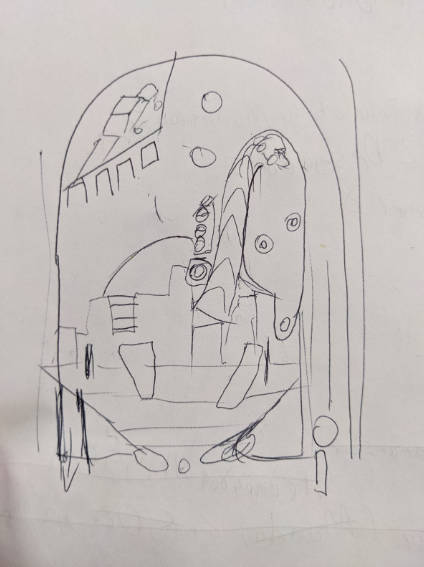
Playfield sketch

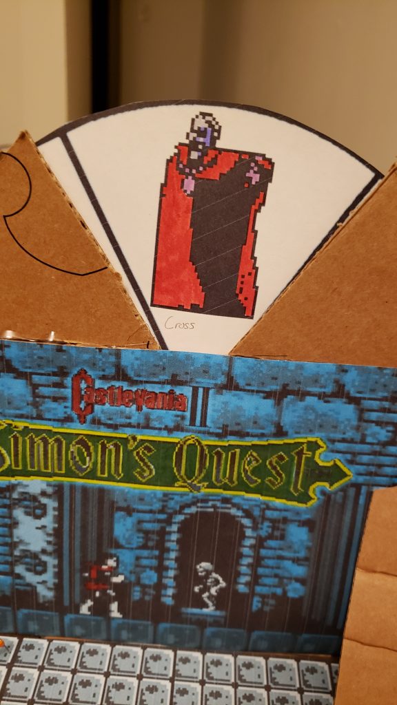
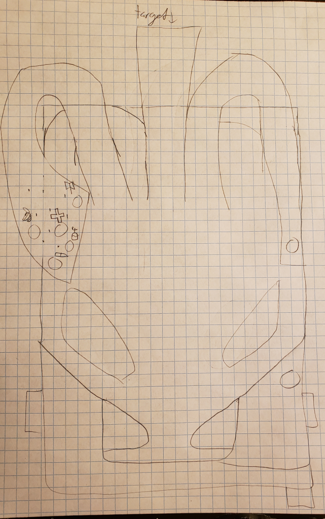
My playfield revolves around what I feel is a unique concept for Pinball, a boss rush. On the backboard, there will be a spinner with several bosses on it that can only be defeated with a specific subweapon. In order to obtain the subweapon, the player must hit the ball up the left ramp which will take them to a bagatelle-like area with a bunch of holes. Each hole will correspond to a different subweapon. Once the player has the correct one, they must fire the ball up the steep ramp in the center and hit a target representing the boss, and then move on to the next boss.

Right now I just have basic layout of how I want the playfield to look, so just the main mechanics and an extra ramp to assist in making the shot to the left. Once I build the machine, I intend to fill in the empty space with whatever seems necessary.

It was important to me to make a machine that doesn’t rely on numerical scoring since I have no way of keeping track of it. I think the boss rush concept works very nicely as a replacement.