I think being able to playtest at The Strong was very useful in getting feedback from people who do not normally game a lot. A lot of the testers that tried my game were kids between 5-13 with their parents sometimes trying as well. It was nice to see the various skill levels of the testers and what elements of the game different people found difficult. There was one young girl who was able to consistently hit every target with easy and found the game enjoyable, while the adult with her struggled to hit a single target over two play throughs. I would love the ability to refine my game even more and test it at The Strong again or even on campus with various students. Hopefully other classes see this as a success and start to integrate outside play testing into their courses.
Author: evh5516
Bringing to Strong Museum
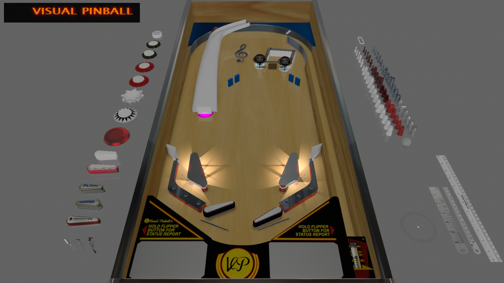
For the presentation at the Strong I will be bringing my advanced Visual Pinball machine, Virtual Virtuoso. I think the elements of the machine play better than any of my previous design and the virtual machine can hold up a lot better than a Pinbox might after 5 straight hours of use.
Virtual Virtuoso (Advanced Visual Playtest)
The feedback I got for my advanced visual playtest was very helpful and insightful. I got valuable information regarding the difficulty of my machine and some of the accessibility of some of the components. My machine was straightforward and clear, but some of the elements were much harder to consistently reach than I had initially thought during my personal playtests.
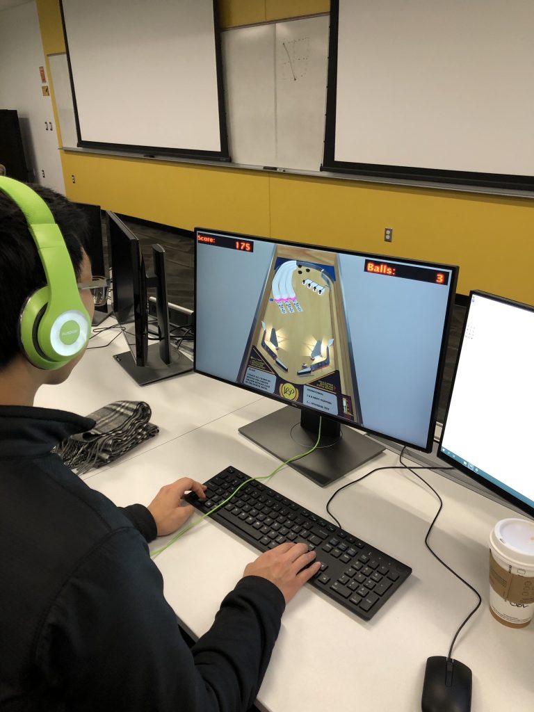
I plan on adjusting the width and location of the drop targets as well removing the reset trigger located on the right. I also plan to clean up the visuals so that targets stand out more and there is no white on white.
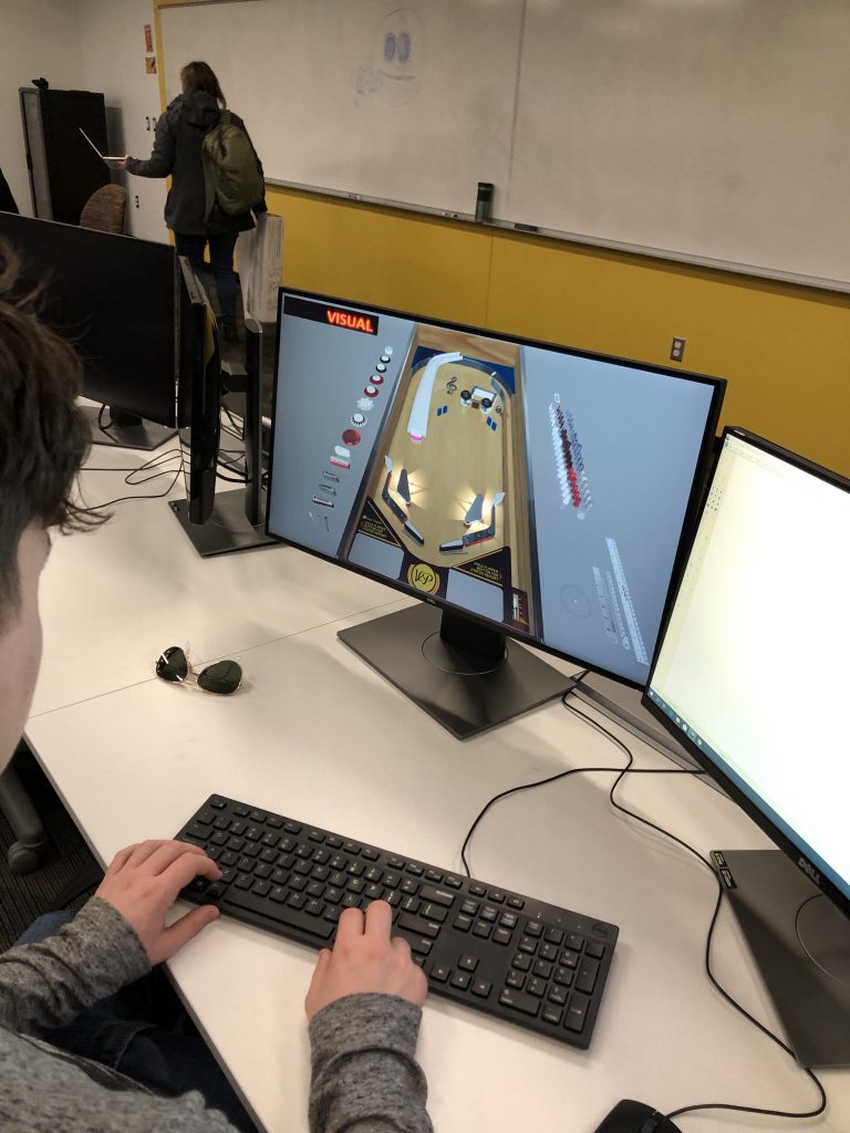
Virtual Virtuoso (Advanced Visual Pinball Pitch)
I plan on building off of my basic Visual Pinball for my advanced machine. I want to change up the layout to have some more ramps, play audio, better integrate drop targets, and change the pacing.
Virtual Virtuoso (Visual Pinball Basic Playtest)
I had some original bugs with the game, but thanks to some help from classmates, I think my first attempt at a Visual Pinball came out pretty nicely. The machine is pretty simple but plays smoothly and consistently.

The feedback that I got was that the game was well paced and gives a good idea for what the advanced machine will look like. The layout will be changed as suggested but for now the simple concepts are there.
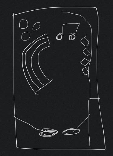
Virtual Virtuoso (Basic Visual Pinball Pitch)
For my basic Visual Pinball machine, I want to make a machine that begins on incorporating a musical element to it. The basic machine will be just some of the game elements I want to incorporate and will later add audio in the advanced machine.
Summer Drift (Advanced Pinbox)
For my advanced Pinbox, I decided to go with a box with a smooth theming and a multi ball feature.
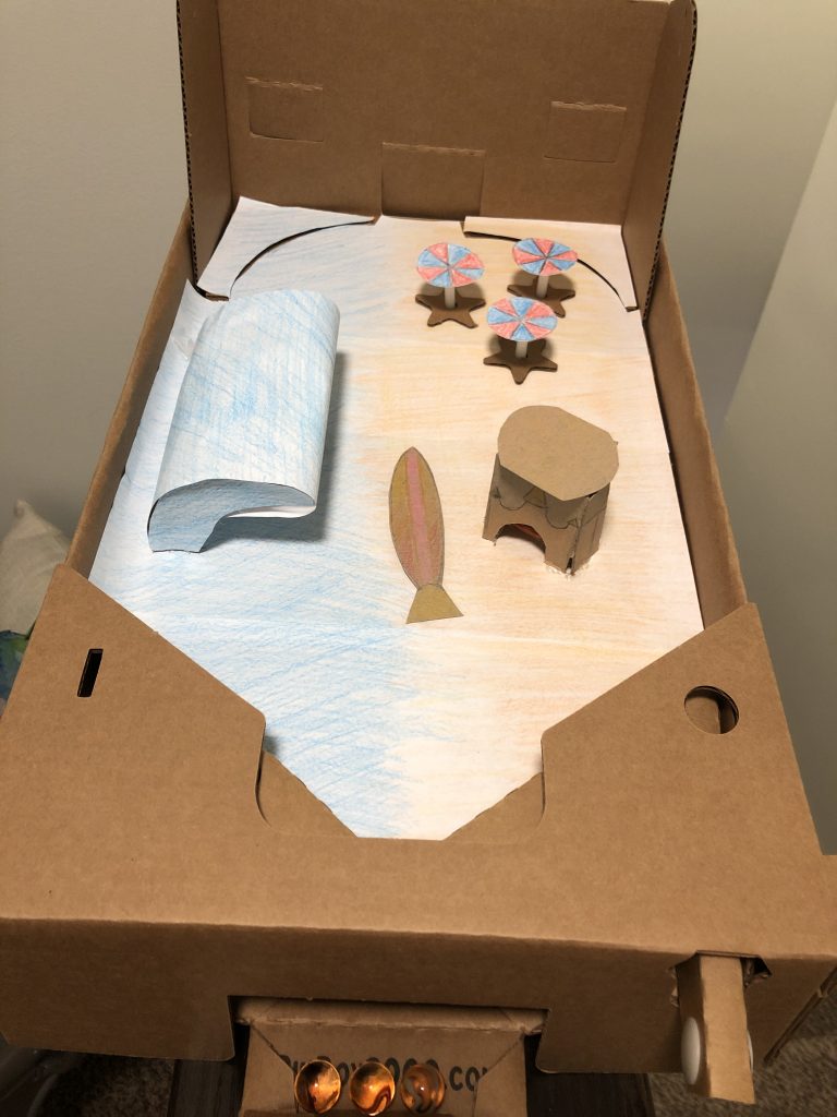
I initially wanted to make the wave more like a tunnel or something that could be rolled onto, but struggled to make something that could take a beating over time. I’m quite content with the simple mechanism I came up with to dispense a multi ball.
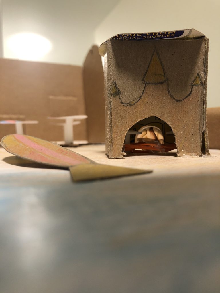
The feedback I received was mostly positive, with some critiques of issues I was aware of from creation. The multi ball could be moved out of its holding if the box is shifted enough. Otherwise, the surfboard ramp is satisfying as well as the wave and umbrellas and the theming is quite nice.
Summer Drift (Formerly Seasonal Drift 2.0) Pitch
For my Advanced Pinball machine I want to work around a multi ball experience as well as a variety of different interactions on the playfield.
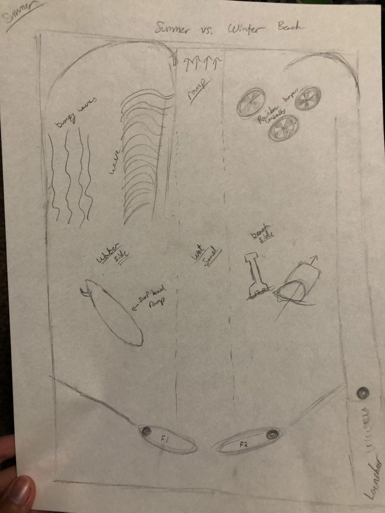
This was the original design I had for my head to head machine. I’ve decided to just work with the Summer theme because trying to create a differently textured playfield to incorporate ice was rather tricky and I really wanted to try to create some sort of wave/tunnel. I plan on changing up a few elements like the shovel and pale to maybe a sandcastle where I can place the multi ball.
Seasonal Drift (Head-To-Head)
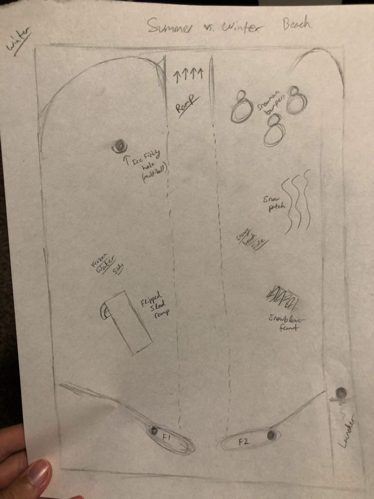
For my head-to-head pinball design, I wanted to make a game with two boards that were very similar in layouts and contrasting in theme. My design developed into a Summer vs. Winter theme rather quickly. With my theme set in stone, I began to draft out some elements that I knew I wanted to incorporate into the playfield, such as rubber band bumpers and ramps.

After sketching in some of the elements that I could easily think of for the summer themed field, I had do come up with some elements that could contrast nicely and thematically. I started with the umbrella bumpers and decided that some snowmen could be a nice comparison. After that, it was just finding similarly shaped or purposed pieces that could be added in as close to a symmetrical way as I wanted.
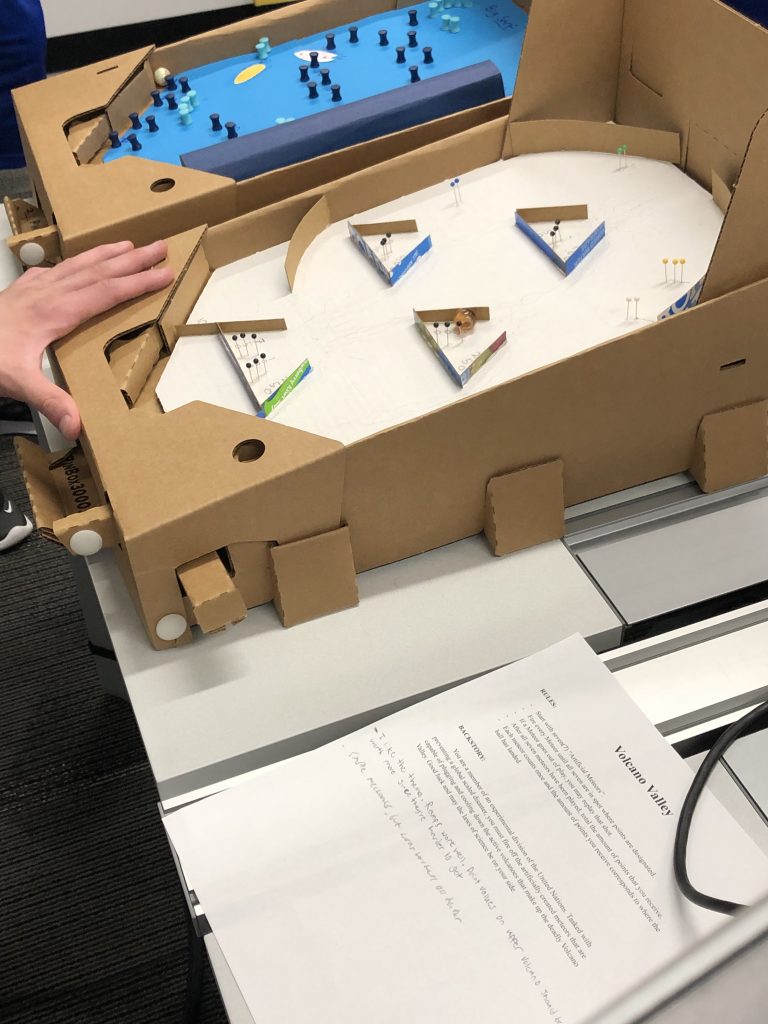
Volcano Valley (Bagatelle) Post Playtest
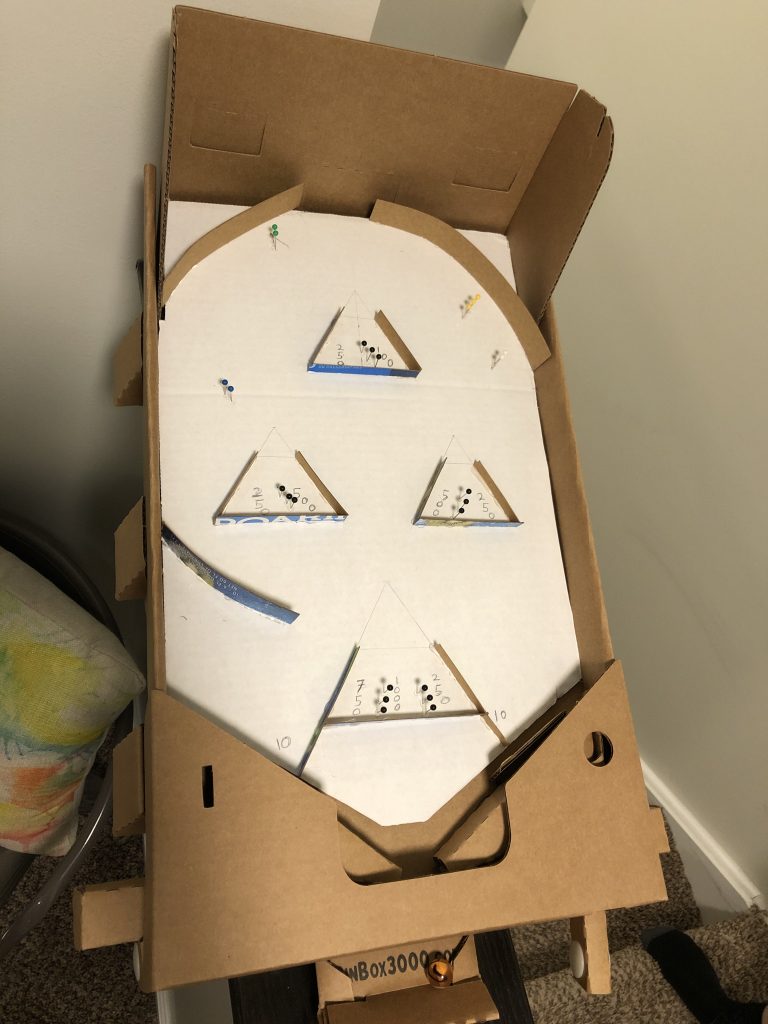
I learned a lot during the creation process of my bagatelle game. I thought that once I had a solid idea in my mind and on paper, that transferring it would be a fairly easy step and that I wouldn’t need to go through too many iterations. I was quite wrong, as designing proper placements for the elements and play testing all the iterations took hours. Once I had a decently refined process for creating the game elements I needed, it came down to just a matter of testing with my roommate and figuring out where things should be to make the game more interesting.
Feedback:
Positives:
-Strong theme
-Ramps and movement work well
-Simple mechanics
-Pocket placement is good
-Good flow of the playfield
Negatives:
-Ball shoots out of playfield frequently if shot too hard or at certain angle
-Point values should be adjusted to better reflect difficulty of certain pockets
